
Selecting a palette for the interior: trends for 2022
Content:
- Why is it important to choose the right color scheme
- General color trends in interior design
- Neutral colors
- Bright colors
- Sherwin-Williams Color of the Year
- What trend colors does WGSN&Coloro highlight
- What will the Pantone Color Institute say?
- Choice of colors for each room
- Color blocking - originality and harmony
Are you trying to follow fashion trends and want to choose the best color scheme for your home? We will tell you what trends are relevant this year and how to transform a room beyond recognition with the help of color! In this article you can familiarize yourself with the main recommendations from the largest companies specializing in the study of color and its role in interior design.
Why it is important to choose the right color scheme
Not all owners of houses and apartments consider it necessary to take modern trends into account, preferring to choose the color themselves. In fact, without basic knowledge about choosing a color palette, it’s easy to make a mistake and present the space being decorated in the most unfavorable color. Today, interior designers are trying in every possible way to avoid “overload” of style, to choose a simple and harmonious combination of colors and decorative elements.
The emotional well-being of residents and guests of the house largely depends on the color of the wall decoration. Too dark a color scheme will make you feel uncomfortable, and “pretentiousness” and abuse of “acid” shades will distract from home and work matters. That is why, when carrying out cosmetic repairs, it is important to focus both on your own preferences and on the advice of experienced experts. It is this combination that will allow you to create the interior of your dreams and will maximally emphasize your individuality and impeccable style.
General color trends in interior design
Today, designers strongly recommend choosing natural tones, which allow you to create the most comfortable environment in your home and feel unity with nature. In the last decade, the trend towards minimalism has been growing: more and more people are trying to give up a huge amount of decor, organizing the space “simply and tastefully”. Remember that in interior design it is important not only to choose the right color for the walls: the shades of furniture, paintings and other elements must also be successfully combined with each other.
Neutral colors
Today, the buyer is offered a large selection of neutral tones - pleasant, calm and suitable for any style of room. In 2022, the most popular of them were the following:
- Gray beige (grage). This is an excellent option for neutral wall decoration, allowing you to create an atmosphere of comfort and tranquility. With it, the viewer's attention will be drawn not only to the wall, but also to the furniture and decor. Grange will look great with black and white, natural shades of blue, yellow, brown and green.
- Angel white. This shade of white has a slight, barely noticeable yellowness. It will help visually expand a small room. Angelic white can be combined with pastel tones and rich shades.
- Olive. An excellent option for those who want to find the most “calm” green option. Suitable for walls, furniture and decoration. Combines with almost any color, including gray, black, white, orange, pastel tones.
- Creamy. This is the most popular neutral color and can be used to create a relaxing and calm environment. At the same time, the room will not look “boring” or too strict. Light shades of brown and gray look great with cream.
- Cool grey. When combined with dark colors, it will help give the room some austerity; when used with a lighter color, it will help create a light and relaxed atmosphere.
Bright colors
Lovers of bright colors will find many elegant and unusual color designs. This year, bright shades such as:
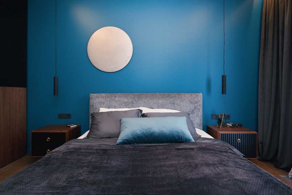
- Rich blue. This color is perfect for decor and upholstered furniture, adding a feeling of freedom, confidence and stability. In too much blue, however, it can create a somewhat gloomy atmosphere, so it should be used with great caution in wall decoration.
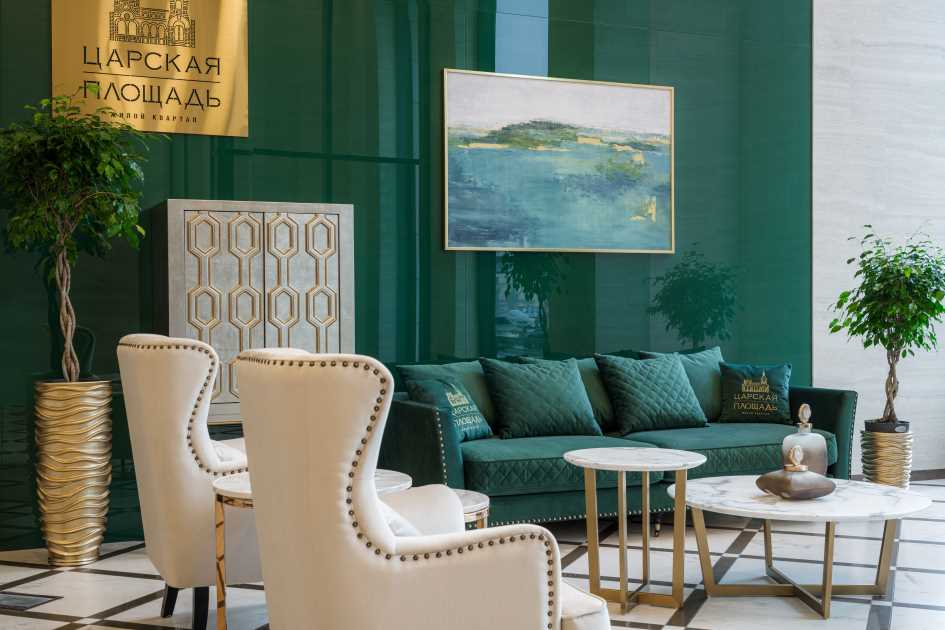
- Multifaceted green. Malachite has been trending for years. It will add an element of luxury to the room and emphasize the good wealth of the owners. An excellent choice for furniture or decoration, as well as for partial wall decoration. Looks good in a palette with black, white, purple or blue.
- Deep yellow. Sunny shades will help add joy and warmth to the interior, while avoiding external overload. This will become especially relevant during the cold season. You can combine yellow with blue, gray, white, black, brown or beige.
- Orchid. Much like the Fuchsia color that was extremely common last year, the orchid color has a slightly more pronounced pink tone. This color will charge you with energy and positivity, filling your home with bright colors.
Sherwin-Williams Color of the Year
Sherwin-Williams is an American company, today one of the largest paint manufacturers. According to representatives of the company, the most fashionable color in 2022 was “Evergreen Fog” - a calm and balanced combination of olive and gray. Thanks to its versatility and calming effect, this color has been one of the most popular finishing materials on the market for several years. It will perfectly highlight all the advantages of the room. Evergreen mist will look good with almost any other shade and is suitable for decorating a space in a "natural" style.
What trend colors does WGSN&Coloro highlight
The WGSN company is a leader in “predicting” fashion trends in the field of interior design. According to experts from this organization, this year the most popular colors are bright shades of yellow and beige (buttercream, military gold, etc.), yellow-orange, deep blue and natural brown. The Coloro palette developed by WGSN is an excellent choice for those who want to create a room with a bright and at the same time discreet design.
What will the Pantone Color Institute say?
Pantone employees assure us that our mood and work productivity largely depend on the colors we spend time surrounded by. The company chose Very Peri as the color of the year - a rich lavender shade that incorporates the best features of blue and red. It can serve as both a component of a bold, experimental design solution (in combination with orange or yellow), and as an element of a calm, cozy home style (for example, if used in combination with white).
The periwinkle color is best suited for finishing accent walls or decorative elements. If you are not planning to renovate your home, you can always purchase pillows or bed linen in a trendy shade. The inclusion of Very Peri in the palette is guaranteed to give the space spring freshness throughout the year.
Choice of colors for each room
When choosing the color of each individual space in the house, carefully consider the specifics of a particular room. Take into account their functional purpose, then it will definitely be easier to navigate the selection of a color palette and just choose the desired shade from the entire variety presented on the modern market. Below are the main recommendations for finishing and decorating the main premises of the apartment.
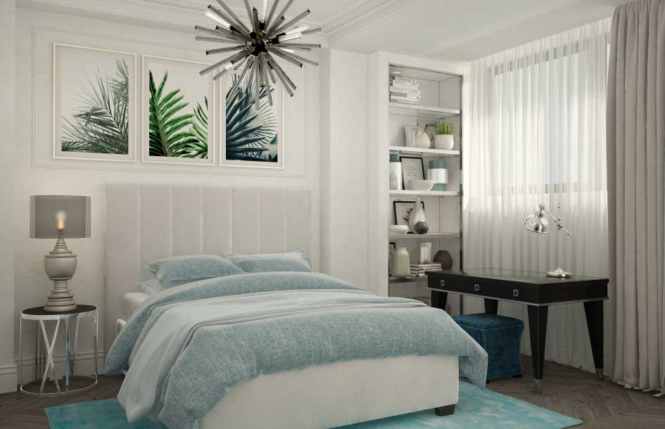
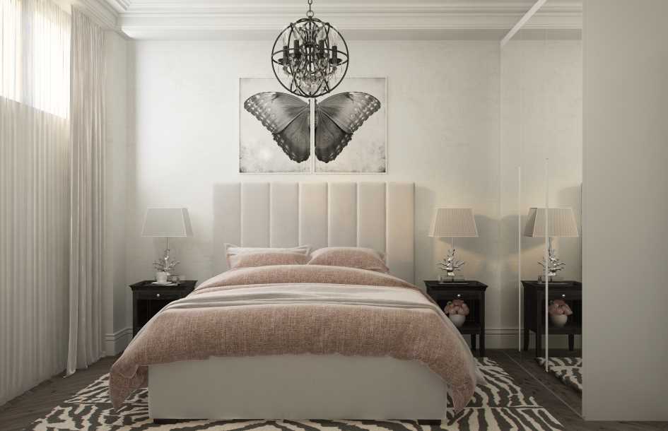
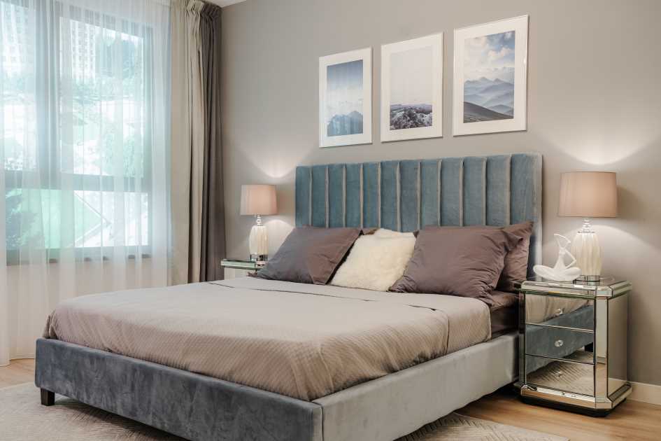
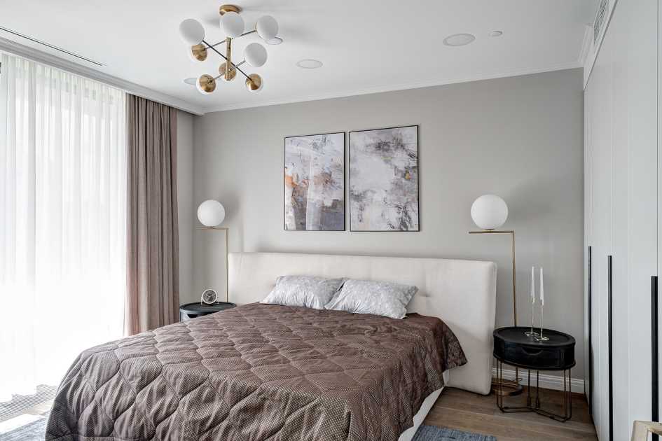
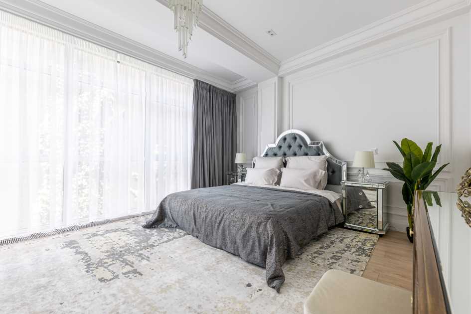
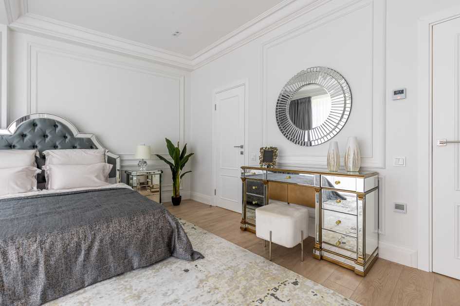
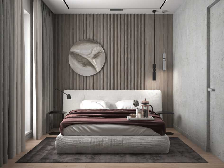
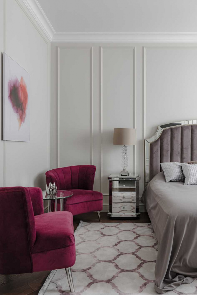
Bedroom
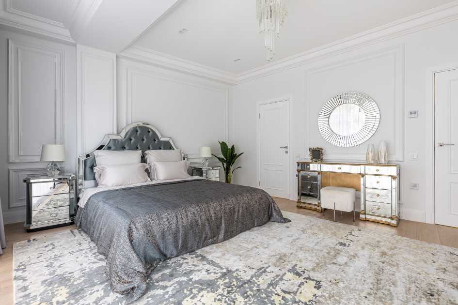
Color solutions for the bedroom should have soft and calm tones: this helps create a relaxing environment necessary for recuperation after a hard day. Shades of gray, pastel colors or various beige colors work well. We advise you to minimize or not use bright colors and overly saturated shades: this can negatively affect the quality of your relaxation.
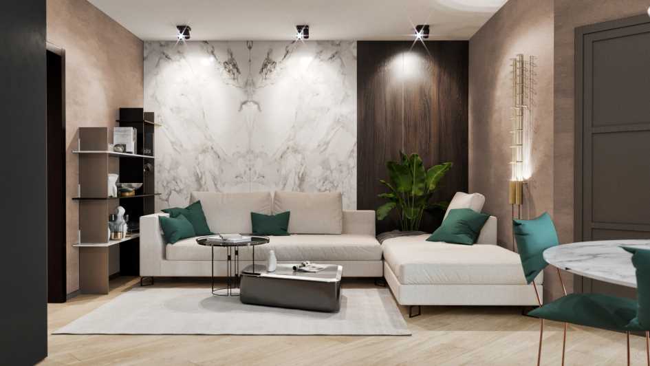
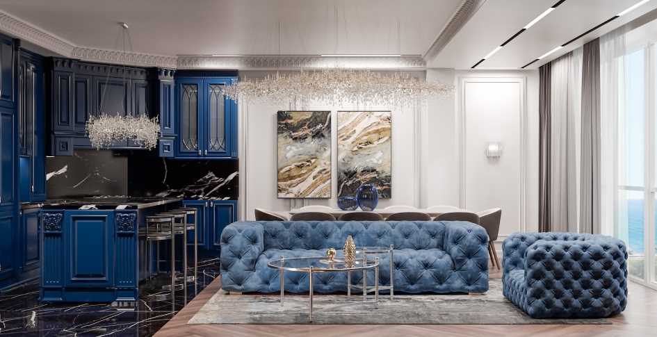
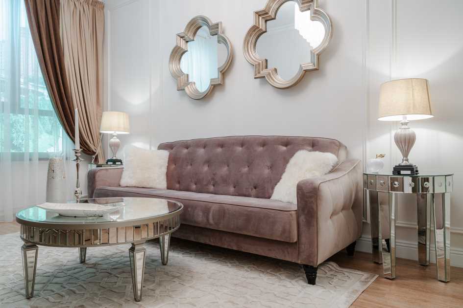
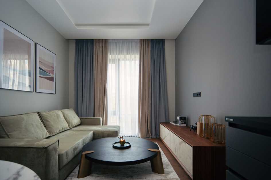
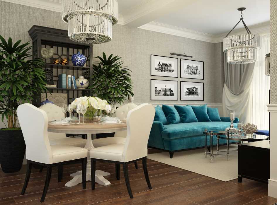
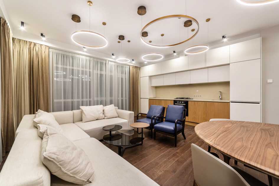
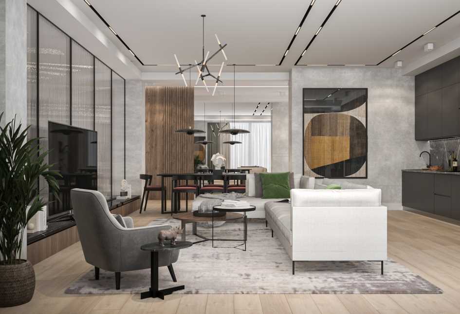
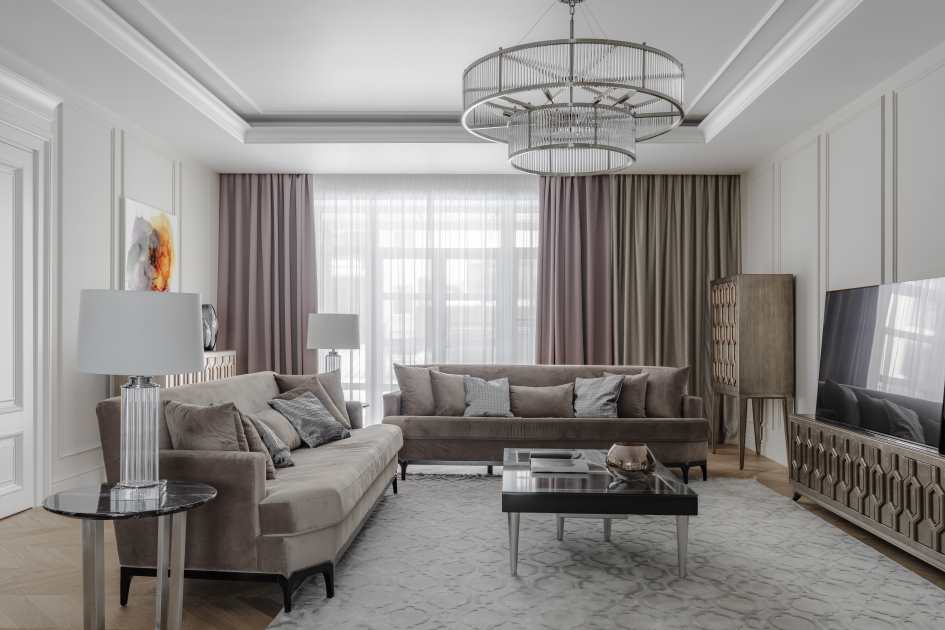
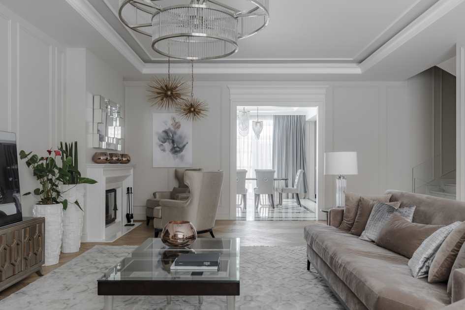
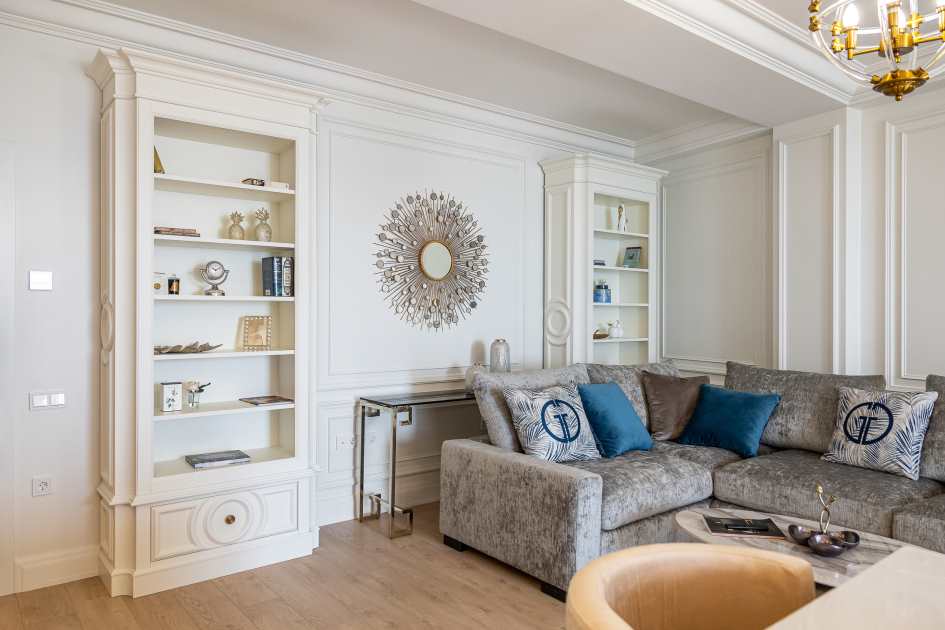
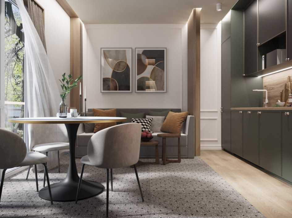
Living room
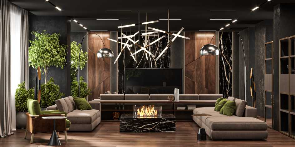
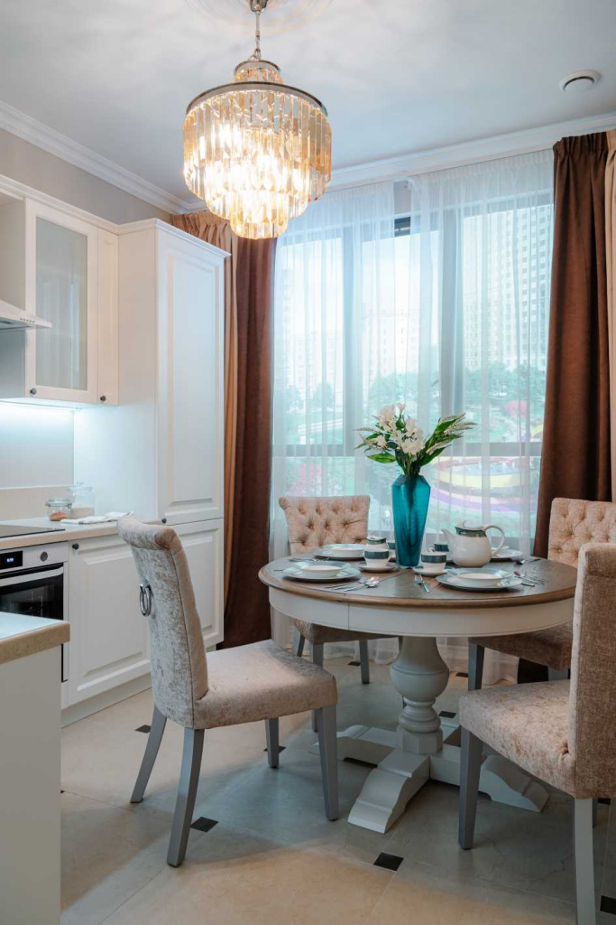
Friends and family members always gather in the living room, so the atmosphere in it should be far from strict and conducive to “soulful” and fun evenings. Calm shades of pink, blue or yellow will highlight the advantages of your living room. Recently, coffee color has been often used, especially when following the neoclassical style.
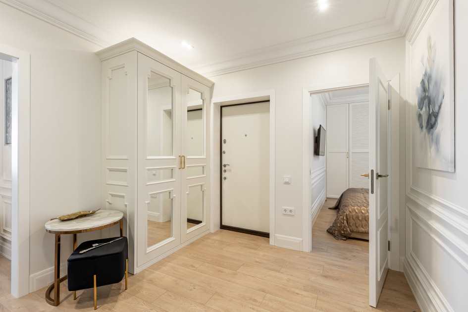
Corridor
Light shades of gray, as well as milky white, remain relevant for corridors. Light tones of blue and green are also gaining popularity. An accent wall would be very suitable for a hallway. Take into account the dimensions of the corridor: for wide rooms a darker palette will be much more applicable than for narrow ones, which are better decorated in lighter colors.
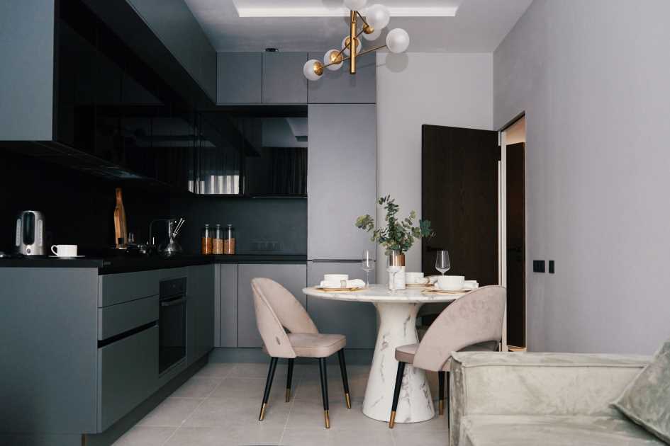
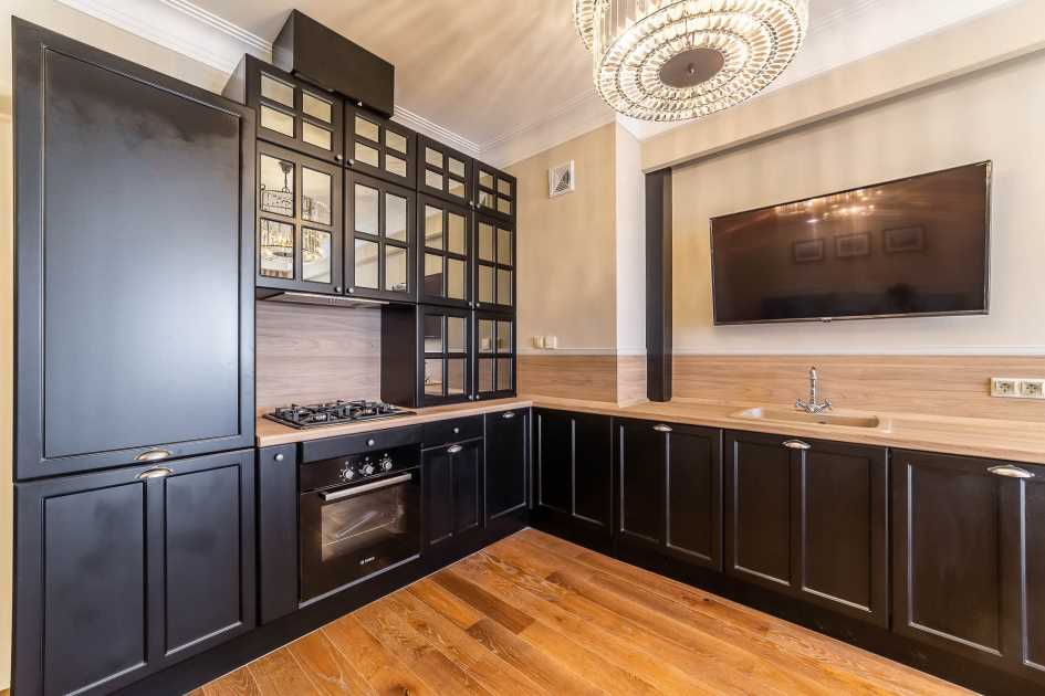
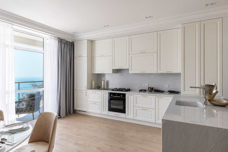
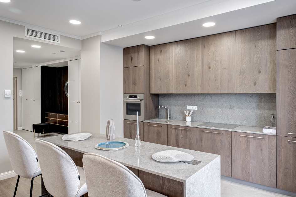
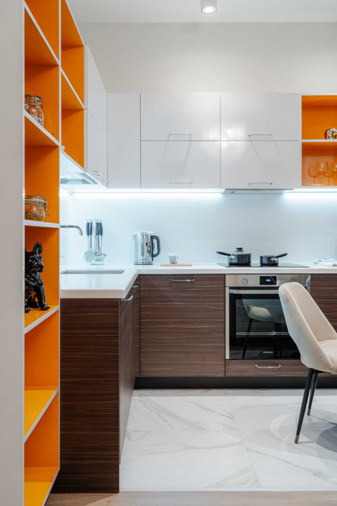
Kitchen
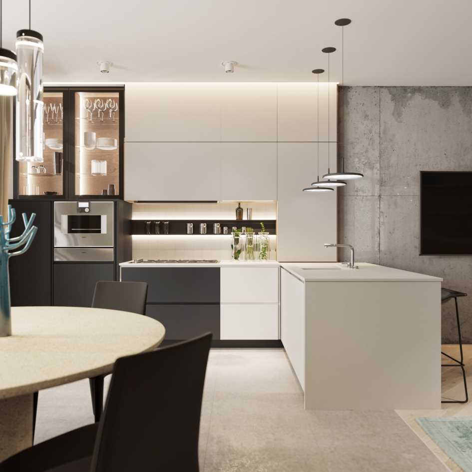
The palette of colors for the kitchen is very wide. A fairly popular solution was to decorate the room in matte blue or green together with light colors. This design would be well complemented by wooden utensils or coral-colored decor. Various shades of gray and brown in combination with white are also applicable. Such combinations will add freshness and lightness to the kitchen, creating a bright spring mood for family feasts and daily meals.
Color blocking - originality and harmony
Do you like non-standard solutions? Color Blocking was extremely common in the last decades of the last century and, more than twenty years later, began to gain popularity again. This is a great solution for those who want to get away from monochrome walls and bring all their favorite colors together.
The essence of the technique is to paint the wall in blocks of different colors. In this case, you need to choose contrasting shades that will complement each other and not violate the integrity of the “overall picture” of the room. This is a very difficult task, so when choosing such a solution, it is best to contact an experienced interior designer who can competently and beautifully bring your idea to life.
The Garda Decor company employs experienced interior designers who constantly monitor trends. We take into account all fashion trends when designing and manufacturing furniture. This is why clients choose us:
- Efficiency. We employ a wide staff of employees and carry out assigned tasks strictly on time.
- Individual approach. We will listen carefully to all your ideas and create a modern interior design that fully matches your preferences.
- Reasonable cost. We take into account the client’s budget, maintain reasonable prices and do not offer services that are not necessary.
Following fashion trends and not forgetting about your preferences, you can create an attractive and modern design for your home or apartment. We will be happy to help make all your dreams come true!
- Color combination in the interior - what shades go together?
- Mint color in the interior - meaning, features, compatibility with other colors
- Colors in the kitchen interior: winning shades and recommendations for choosing a color palette
- How to visually enlarge a room: ideas and methods, advice from professional designers
- Blue color in the interior and what other shades does it combine with li>
- Interior in gray colors: the best design solutions and compatibility with other colors
- Striving for perfection: how to use white in the interior