
Combination of colors in the interior - what shades go together?
Content:
- Popular color solutions in the interior
- What is a color wheel and how to use it
- The psychology of color: how different colors and shades affect people
- Selection of colors for the interior: rules and tips
In the process of interior design, special attention should be paid to the selection of color palette. The colors and shades used largely determine how the space will look: strictly and laconic, warm and cozy, bright and cheerful. In addition, colors directly affect the quality of sleep, well-being and mood of a person. Composing a harmonious color composition is a creative and interesting process, so it’s time to study the advice of designers and start creating a masterpiece interior.
Popular color solutions in the interior
To achieve the perfect combination of colors, it is worth familiarizing yourself with their classification and compatibility. Here's what you need to know when starting interior design:
- Gray, black and white colors are universal. They are perfectly “friendly” both with each other and with other colors, and adapt to any style in the interior.
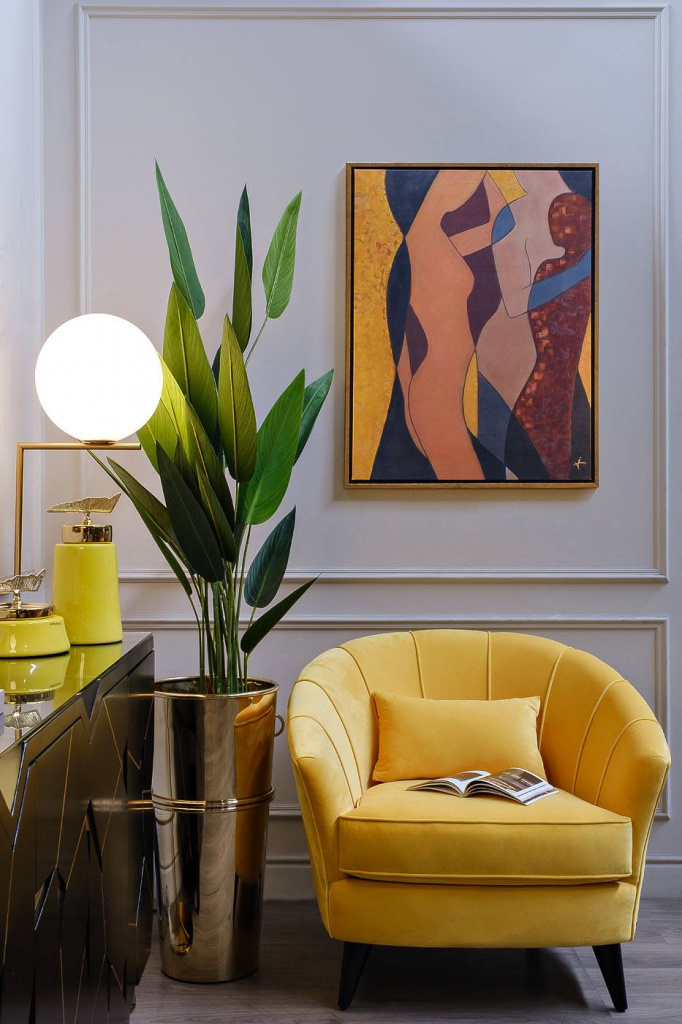
- Depending on temperature, colors are classified into warm, cool, and neutral. The first group includes “fiery” colors: orange, yellow, red. The cold type includes colors reminiscent of the sea - blue, white, turquoise, blue. A neutral position in the interior of rooms is occupied by muted tones, which, compared to pure colors, are not too pronounced: beige, lilac, green, various shades of brown.
- The brightness of a tone is its original state without any impurities. The brightest colors in color include pure colors of the spectrum, as well as shades close to white. The more white there is in a particular tone, the higher its brightness.
- Color purity is measured by such an indicator as chromaticity. This indicator is measured by the amount of gray, black and white that are added to the color. One must distinguish saturation from brightness and chromaticity - the ability of color to transform depending on conditions, for example, lighting.
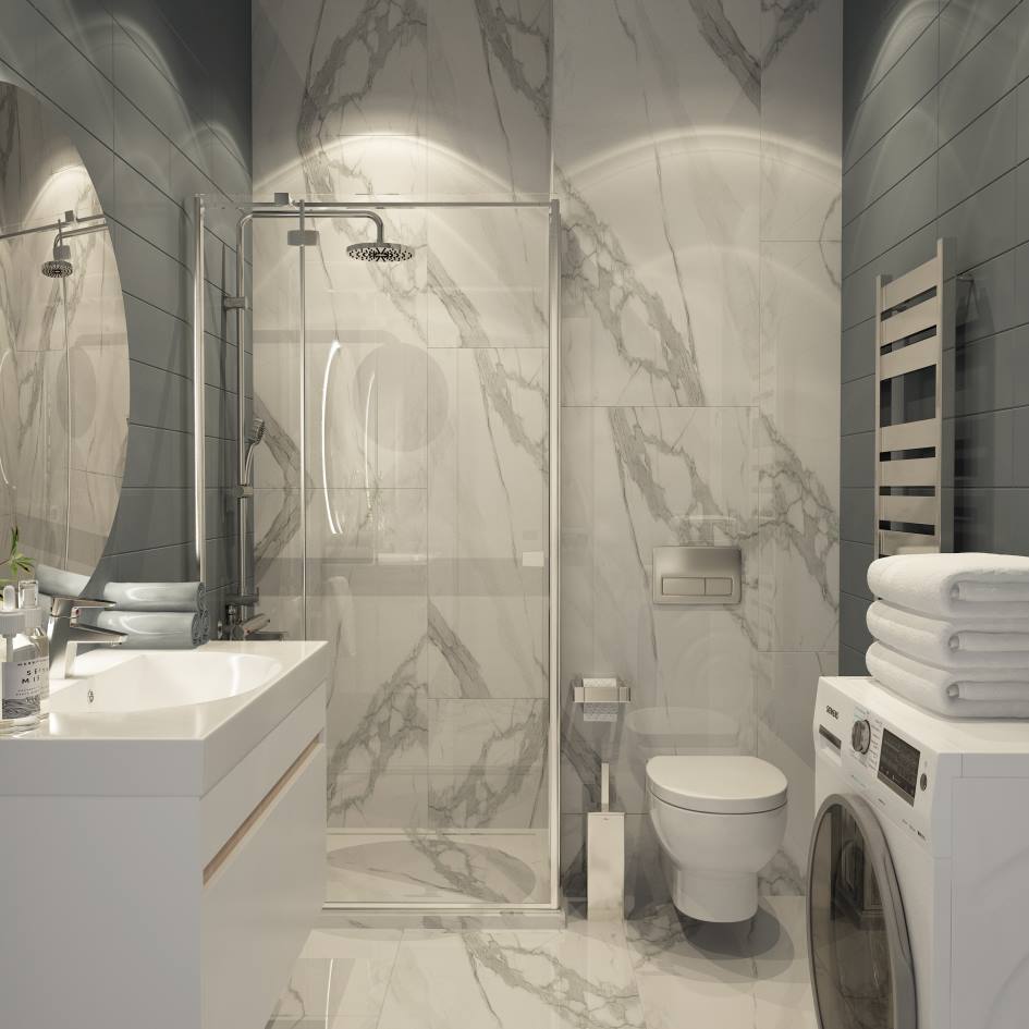
When choosing matching colors for a room, you need to consider its purpose. It is especially important to correctly design the space of rooms in which people relax: bedrooms, children's rooms. The best colors for a bedroom or nursery that allow you to relax physically and psychologically are beige, pastel, soft pink shades.
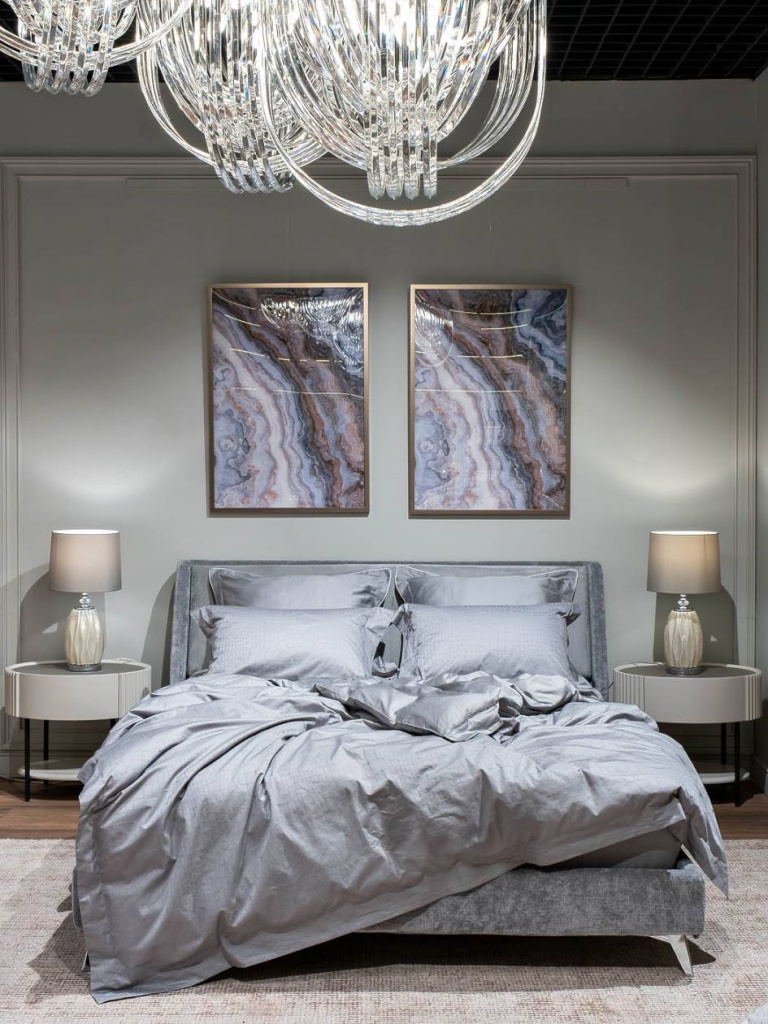
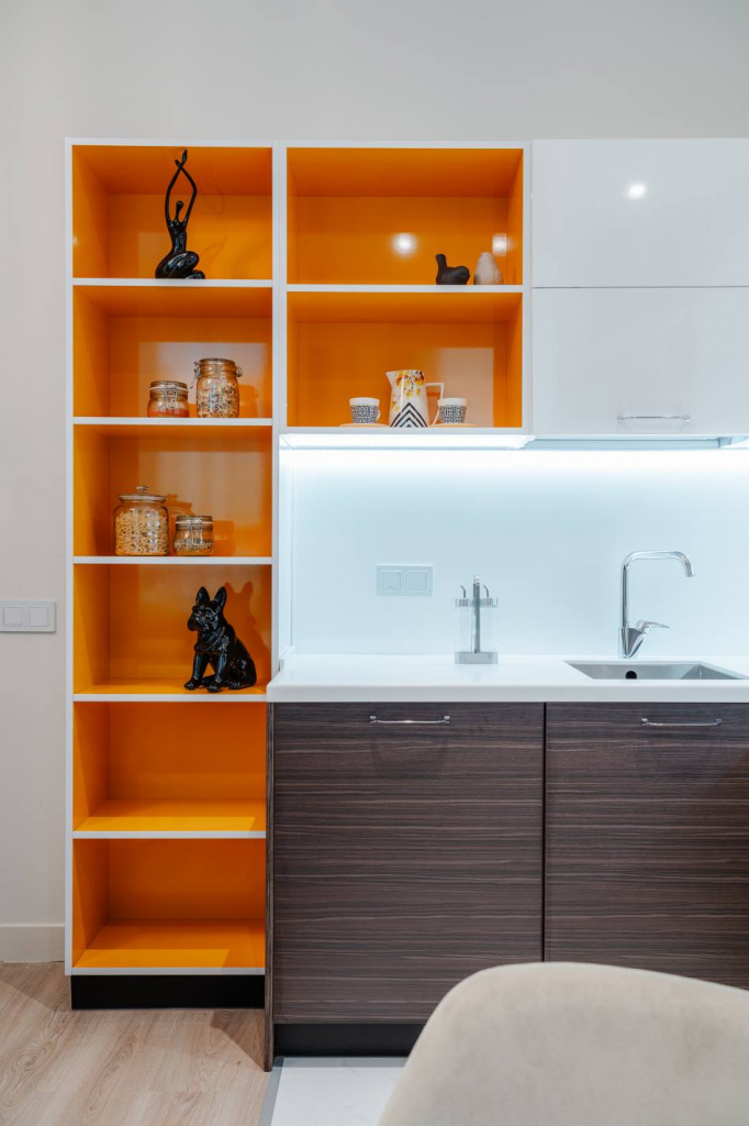
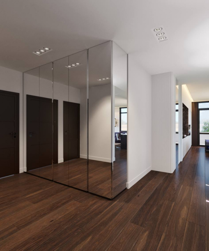
When choosing a color scheme for the hallway, you should take into account the overall design, layout, and type of lighting. For example, in cramped hallways with local lighting, light colors are welcome, and in a large room you can afford to use deep colors: purple, brown, burgundy, fuchsia. White and soft blue shades look great in the bathroom, symbolizing purity and freshness.
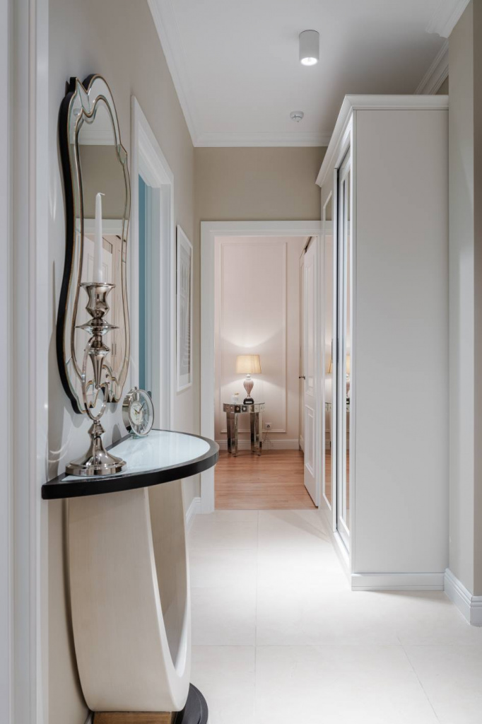
Despite the variety of colors and shades, there are win-win, time-tested color combinations suitable for decorating living rooms, kitchens and other rooms:
- Brown and beige colors are a harmonious combination for large rooms. An organic addition to such a duet will be decor with gilded elements.
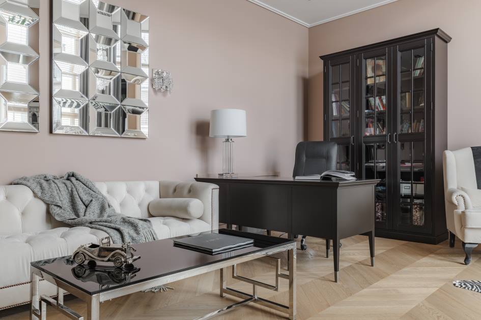
- Red and white colors are a godsend for people who are not afraid to experiment with bright, rich colors. White usually plays the key role in this tandem, and shades of red are used for accents.
- Gray and milky colors. The gray color, which does not have a pronounced emotional connotation, goes well with soft light tones - the interior turns out to be peaceful and calm.
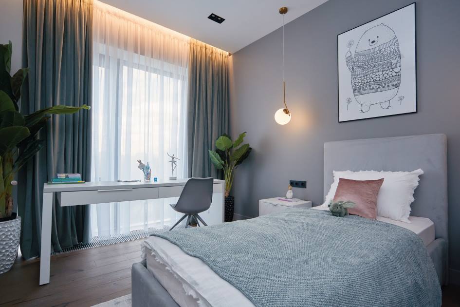
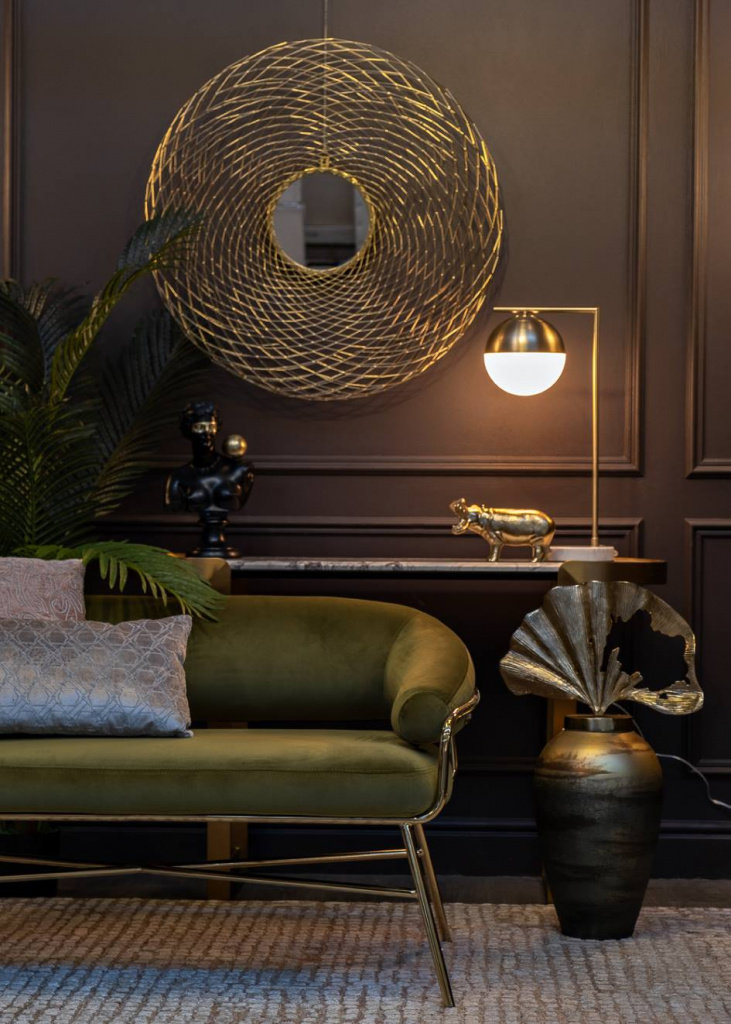
- Green and walnut colors. On a subconscious level, the green color is associated with nature, the energy of living plants, which charge a person with vigor. The amount of green in the interior depends on its saturation. For example, dark emerald tones are considered visually heavy, so they are used in strictly measured doses. When paired with green, it is recommended to use walnut, pine color and other woody shades with the appropriate texture.
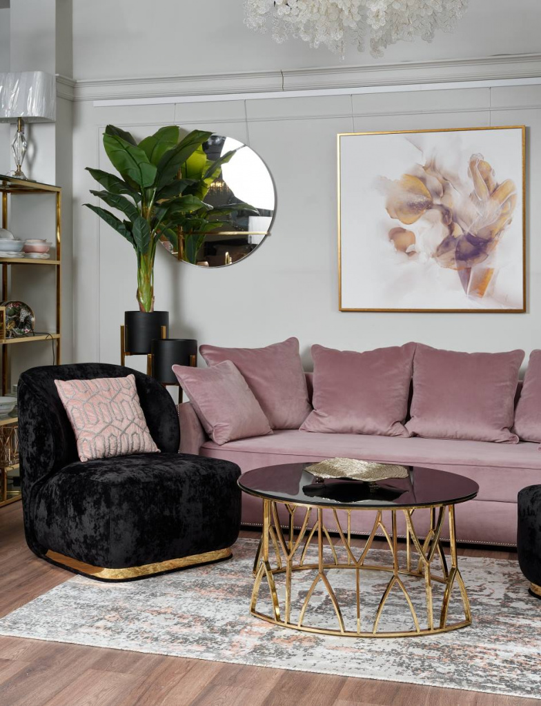
- Purple and white. Purple is a deep, saturated color that has a powerful energetic effect. In large quantities it can cause melancholy, but the presence of white (for example, white furniture combined with purple wall panels) neutralizes this disadvantage. You can add notes of noble luxury to a white and purple interior with the help of gold-plated or silver accessories.
- Pink and turquoise colors. This, at first glance, extravagant combination in reality looks stylish and original. The turquoise color in the interior will remind the owners of pleasant things: the sea, freshness, Tiffany jewelry. As a complement to the turquoise color, which is soothing and positive, you can use pink and coral accent details: textiles, vases, decorative pillows.
What is a color wheel and how to use it
To select colors that match each other and make up an ideal composition, interior designers use the Itten color wheel. It is a 12-sector diagram that helps to find better color combinations, structure colors in the interior and subordinate them to the rules of color perception - the way a person sees shades and reacts to them. This useful tool was developed in the 17th century by the Swiss artist Johannes Itten and is quite easy to use.
At its core, the Itten circle is a collection of all colors, tones and halftones, arranged in sequence from cold to warm. Itten considers the three primary colors to be red, yellow and blue. The next three are additional colors formed by mixing the colors of the fundamental group - orange, purple, green. All other colors are derivatives - such paints are obtained by combining colors from the first and second groups in different proportions.
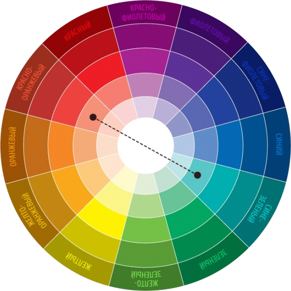

The color wheel works as follows. People who want to furnish the interior of their dreams are offered the opportunity to choose from several canonical color schemes:
- Monochrome scheme, loved by most fashion designers. To design, you need to take three colors that are located next to each other on the color wheel and are varieties of each other. This is a win-win option that allows you to create a beautiful, calm interior.
- Complementary scheme based on contrast. The combination is based on the use of two colors that are on opposite sides of the spectrum. One color is the dominant background, and the second color is used to create accents. If the interior seems a little provocative, you can soften it with accessories in neutral shades.
- Triad. The “triad” color composition uses three colors located in the corners of an equilateral triangle. In this case, color compatibility is guaranteed, but you can work with shades - the use of halftones gives an unobtrusive, calm decor.
- Tetrad is a polychrome scheme. This scheme provides for the use of four colors. To select them, you need to mentally draw a square on the color wheel - the desired colors will be in the corners of this square. One color will play the main role, two more colors will complement it, and the fourth shade is intended to create accent splashes. The result is a bright, rich, interesting interior, but over time the variety of colors will begin to tire. But in oriental and ethnic interiors, a notebook is what you need.
Color psychology: how different colors and shades affect people
All people react to certain colors differently: the reaction to color depends on psychological type, gender and even age. There is no clear division of colors into “female” and “male”, but there are some features:
- Blue is a calming color that is loved by both men and women.
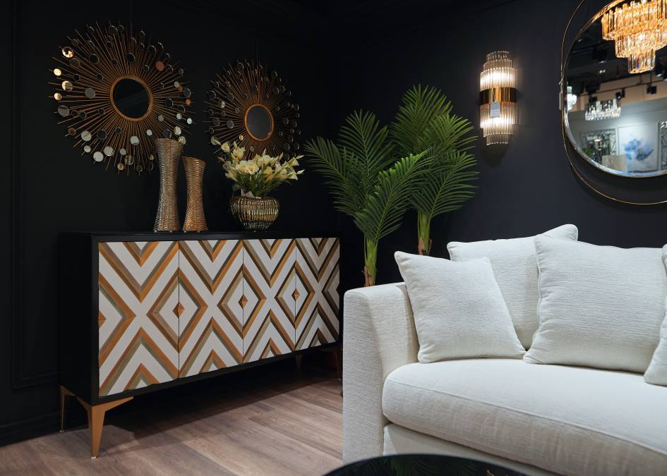
- Purple is the color of secrets, mysticism and riddles, and is a purely feminine color.
- Turquoise color, reminiscent of the sea, is traditionally chosen by women. The same can be said about the color pink - the color of youth, tenderness, sensuality and romance. And if a woman categorically refuses to use pink details in the interior, most likely she is a very pragmatic person.
- Men, due to their physiology, perceive about a third fewer tones than women. If a woman can choose for a long time between peach and, for example, yellow-pink flowers, these colors are identical for the stronger sex.
- According to scientists, most men like black and cool variations of green. But men prefer not to use pink and purple colors, although there are exceptions to every rule.
Selection of colors for the interior: rules and tips
When choosing color schemes that will create coziness, comfort and harmony, it is worth considering some more rules and tips:
- When decorating a space, it is advisable to use no more than three colors. Otherwise, the colors will visually overload the interior and distract attention from the main idea.
- The ceiling and floor should be different colors. When choosing the color of furniture, it is recommended to follow this rule: it should be darker than the wall covering, but two or three shades lighter than the floor.
- It is advisable to match the apron in the kitchen to the color of the countertop, and other pieces of furniture can be of a different color.
- For the bathroom, it is important to find the optimal balance of invigorating colors that bring joy at the beginning of the day. White with chocolate, white with beige, light gray with blue - all these color combinations will set the right mood.
- If the chosen color of furniture or decoration does not live up to expectations, accessories of proven favorite colors or large accents of neutral shades will help correct the situation.
- A small room is visually enlarged by colors belonging to a cold palette. In addition, any of the cool colors visually lifts low ceilings.
- Interior is a static concept; people do not change it as often as clothes. To make it appealing to all family members, it is better to decorate common gathering places - the kitchen, living room - in neutral colors.
- When choosing a color scheme, you need to be guided not only by the rules, but also by intuition. Analyzing your favorite shades will help you understand what associations each of them evokes. For example, if a person feels comfortable in green clothes, perhaps this option will be appropriate in the interior. But there is no need to chase fashion: of course, fashion trends play an important role, but sometimes beautiful pictures have nothing to do with comfort and practicality.
- There is no categorical answer about the most incompatible interior colors. In modern fashion, creativity and extravagance are encouraged. If previously the combination of red and green was considered flashy and tasteless, today there is a place for it in some design projects.
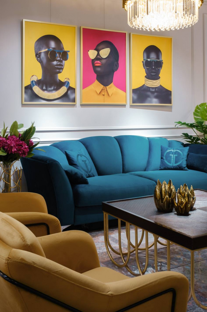
- The proportions of colors in the interior must be selected as follows. The share of the primary color, which is usually used when decorating walls, accounts for approximately 60%. The share of additional color in which the floor, ceiling and furniture facades are painted is another 30%. The remaining 10% of the color space will be occupied by accent details - rugs, sofa cushions, ceramics, window textiles.
So color is one of the most important elements, which is a powerful tool for creating a comfortable interior for living. It has a huge impact on the human subconscious and visual perception of the environment. If you have doubts about your abilities, you should seek help from the designers of the Garda Decor company. Experienced and talented specialists will show all their abilities and select the best colors, among which the owners will feel as comfortable as possible.