
Blue color in the interior and what other shades it combines with
Content:
- The meaning and characteristics of the color blue
- Shades of blue and its combination with other colors
- Common mistakes in using blue
- Blue color in the interior of different rooms
The emotional state of a person largely depends on the competent selection of the color palette of the interior. This or that color can create a cozy atmosphere, calm, excite or set you up for active activity. According to psychologists, shades of blue, which evoke associations with the sky, water surface and fresh sea breeze, have a particularly strong influence. Since many people consider the blue color in the interior to be too cold and dark, it is not often used in interior decoration. However, this opinion is wrong: with the help of blue-bluish tones you can create the most comfortable space. But first you should find out what colors they harmonize with, what rooms they are suitable for and how to avoid mistakes when developing an apartment design project.
The meaning and features of blue
From a psychological point of view, the blue color, representing natural motives, is the color of organization, reliability, and leisurely decision-making. On the one hand, it relaxes and restores peace of mind, on the other hand, it helps to concentrate and get into a working mood. When decorating a space, blue allows you to solve the following problems:
- Visually enlarge the room.
- Create a feeling of comfort, calm, silence.
- Make the room bright through the use of individual details (furniture, decor).
In styles such as modern or classic, shades of blue can be used as a basic background. Experts also believe that it reduces claustrophobia. For this reason, blue color will be a good choice for decorating small rooms without windows (bathrooms, dressing rooms).
However, everything is good in moderation. It is believed that an excess of blue tones can cause melancholy, feelings of despondency and anxiety. Therefore, to achieve harmony, you need to dilute blue with other colors. There is one more rule. Light shades (azure, turquoise) are suitable for finishing large surfaces (ceilings, walls), and deep dark tones are suitable for emphasizing individual details (curtains, accessories).
Shades of blue and its combination with other colors
When decorating residential premises, many shades of the basic blue color are used. These shades differ significantly depending on their style:
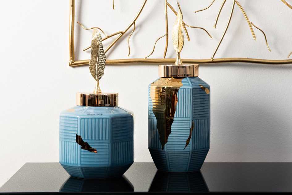
- Pure blue looks rich and creates a feeling of coolness in the heat. A room decorated in similar colors looks aristocratic and noble. Examples of the use of pure blue shades are found in both oriental and classic European interiors. Americans are also partial to pure blue. For example, in the USA the following color palette is often found: a beige main background and bright blue details.
- Blue-green is a traditional color of southern landscapes. This option can be recommended to people who want to furnish a house in a Mediterranean, classic, or colonial style. The result is a strict and at the same time cheerful color scheme - just what you need for a pleasant holiday. To complement the interior, you should use blue-green shades in spots (for example, in the living room, lounge area or library).
- Light blue is the color of peace, comfort, stability. It does not tire the psyche, and therefore can be safely used, for example, in bedrooms or children's rooms. Of course, the interior, made in light blue tones, does not look very high-status, but for a good rest you won’t find a better option.
- Grey-blue. Gray-blue shades, devoid of sharp contrasts, are typical of the Provence and French Romanticism styles. They pacify, relieve anxiety, create an atmosphere of comfort and silence. However, these tones are typically used in medical settings. Therefore, in order to avoid dubious associations, you should not overdo it with them. It is best to dilute the color palette with warm and eye-pleasing shades: beige, pistachio.
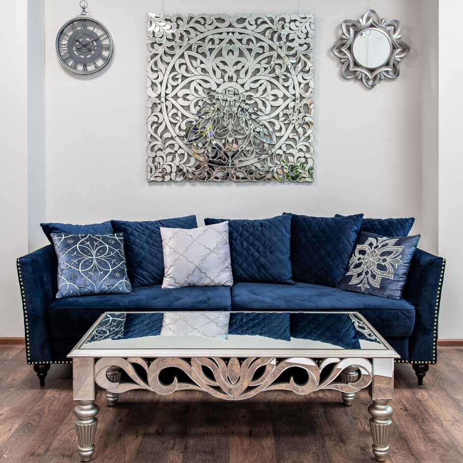
The next important question is the combination of blue with other colors. So, a combination of blue and white tones is considered a win-win option. A room decorated in this way looks spacious, bright, and visually light. This union is ideal for small spaces. To create a marine style, it is not necessary to make renovations: you can refresh the room with the help of decorative pillows, Gzhel, ceramics with blue and white painting.
Perfectly harmonizes with blue and yellow colors. This combination will certainly appeal to extraordinary people who are partial to original things. The combination of lemon and cornflower blue tones looks best: such rich shades are indispensable when decorating country-style apartments.
Blue looks much more extravagant in combination with red. You won’t be able to relax properly in such a room, but such a color palette invigorates and stimulates new achievements. It can be recommended for arranging work rooms and playrooms, but in the latter case blue shades should predominate.
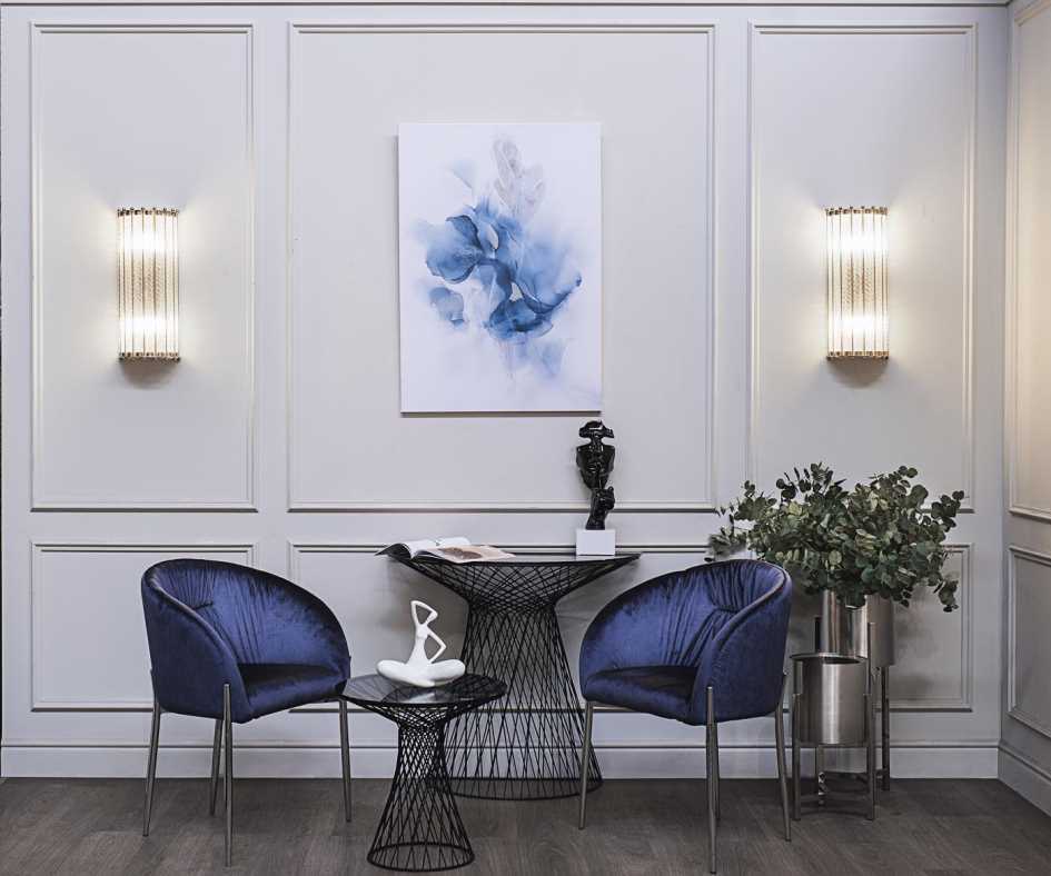
A mix of blue and light blue is also very popular. This combination calms the nervous system, gives a feeling of security and promotes normal sleep. In addition, it has some therapeutic effect, lowering blood pressure. So sleeping in a room decorated in blue tones will be very comfortable.
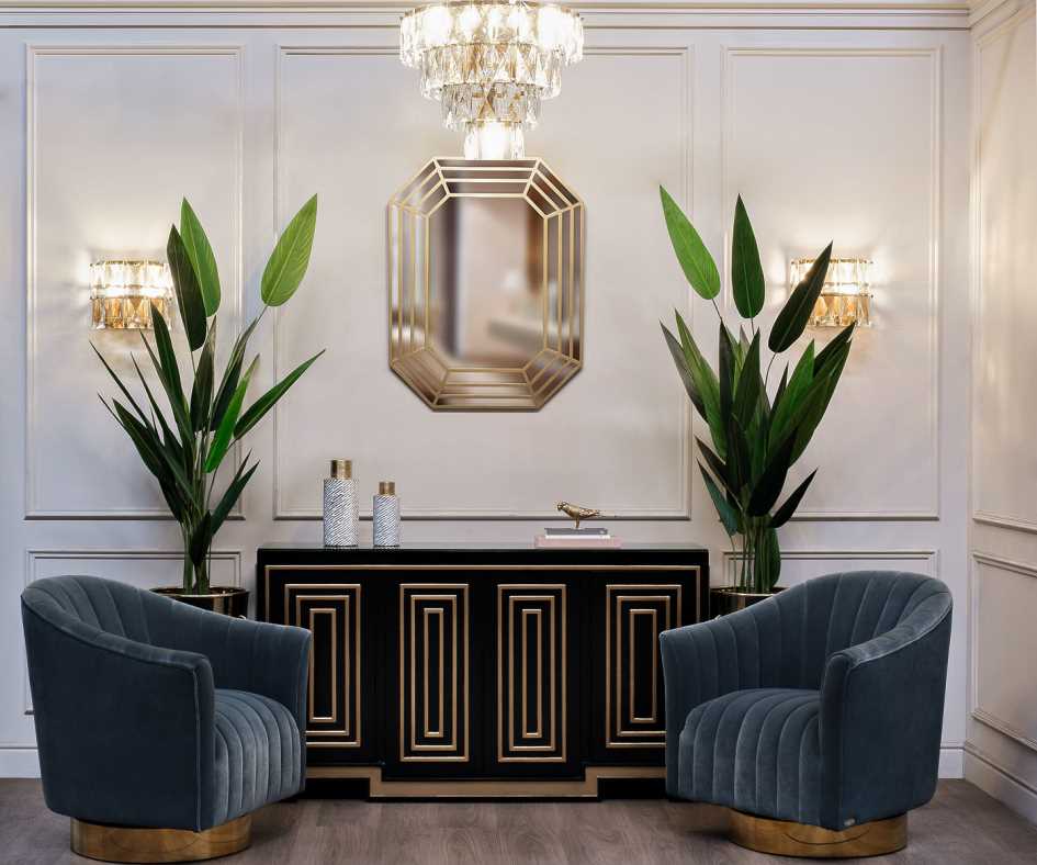
The tandem of blue and black is quite specific. Indeed, many may find it boring and even mournful. However, in spacious, bright rooms this combination looks very interesting. You can dilute gloomy tones with a small amount of green, orange or yellow (sofa cushions, ceramics, lamps).
Common mistakes in using blue
Since the services of interior designers are expensive, most people try to make their home comfortable on their own. But not everyone manages to approach the matter competently, and this is especially true for the color blue, which must be used carefully. Here are the most common mistakes:
- Excess blue. This color is rarely used as a main color. This is mainly an Art Deco style, where large blocks of blue tones predominate. However, shades for Art Deco must be selected carefully, otherwise the room will look cold and uncomfortable.
- Combination of blue and brown. These colors do not harmonize very well, although adding small details in brown or coffee shades is acceptable.
- A combination of many colors. The interior, the creation of which, in addition to blue, involves several bright shades (red, yellow), looks tacky. Such a combination tires the eyes and psyche, and the person will feel uncomfortable. Therefore, it is better to avoid such annoying options.
Blue color in the interior of different rooms
Now it’s worth figuring out how appropriate it is to decorate the interior in blue colors in different rooms. Here's what designers think about this.
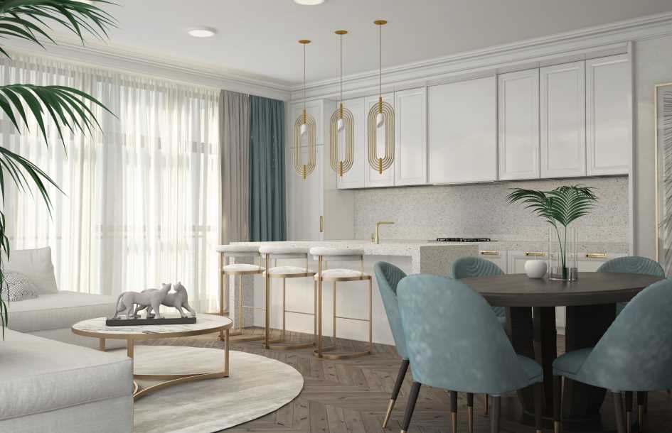
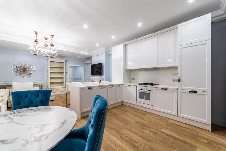
Kitchen
Blue facades of kitchen units are found in many Russian apartments. A kitchen furnished with blue furniture looks bright, fashionable, and stylish. An interesting option is colored household appliances (for example, a blue microwave or refrigerator), as well as additional blue parts:
- Kitchen textiles.
- Pots, ceramic dishes.
- Cute trinkets that add coziness to the kitchen.
To create a comfortable environment, blue needs to be diluted with other shades. The favorite in this regard is white. Thus, lovers of Russian folk motifs can decorate their kitchen in the Gzhel style. To do this, you can choose the appropriate ceramic tiles or simply paint the walls white.
Buying blue kitchen furniture also has its own characteristics. It is better to give preference to matte facades: glossy cabinets often look cheap. The best choice would be a set in a noble blue shade with well-finished edges and hidden fittings.
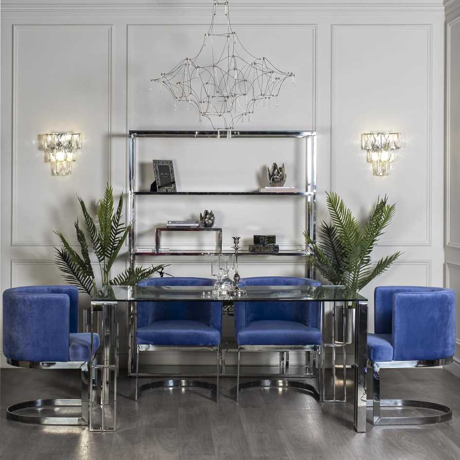
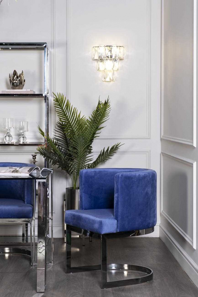
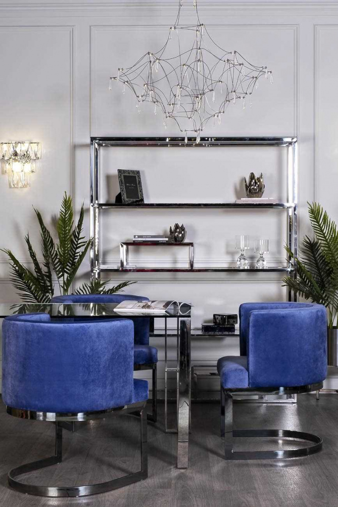
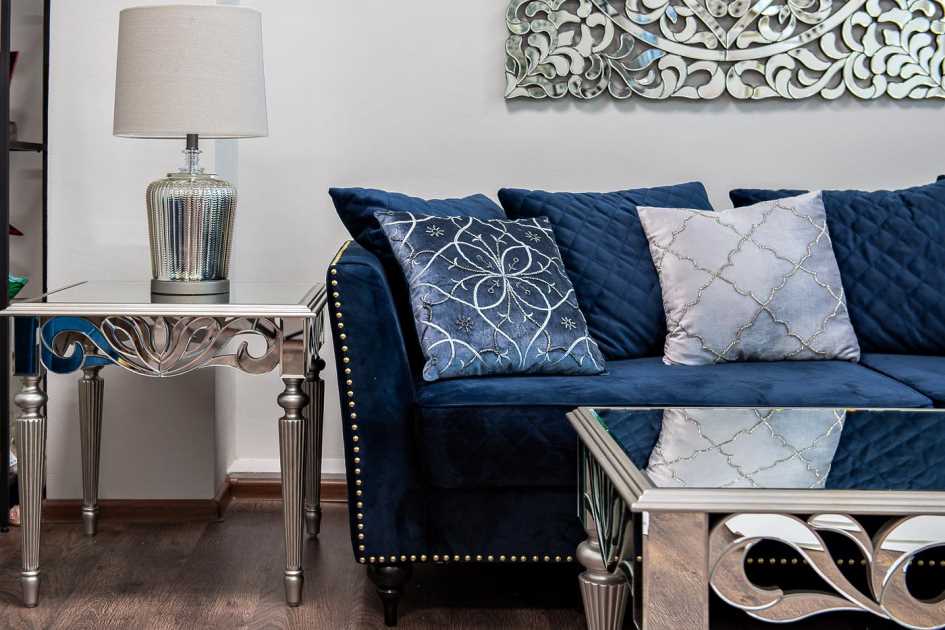
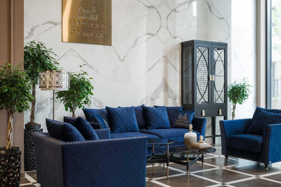
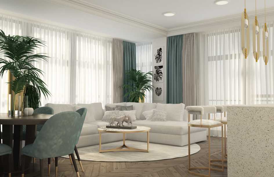
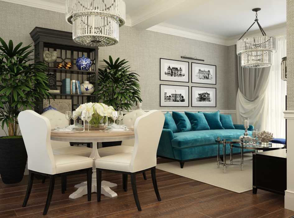
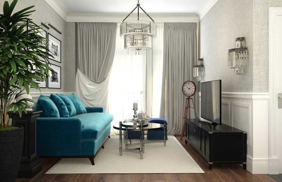
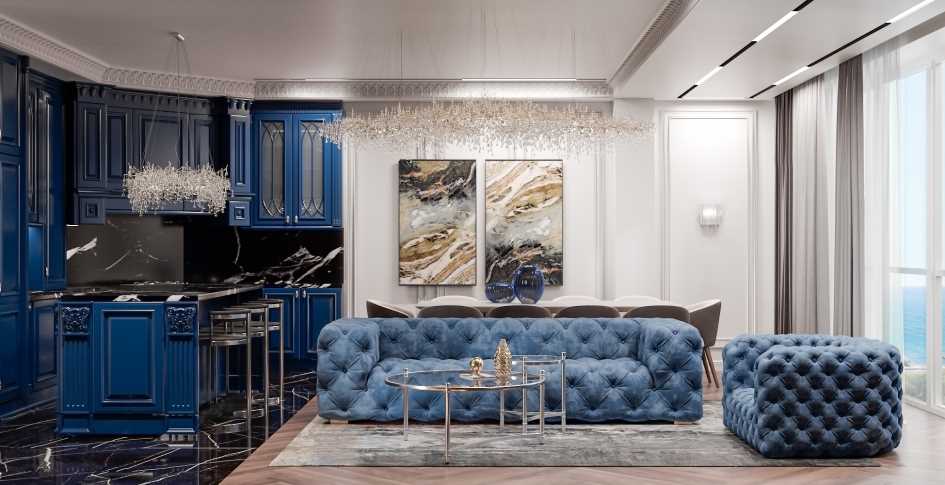
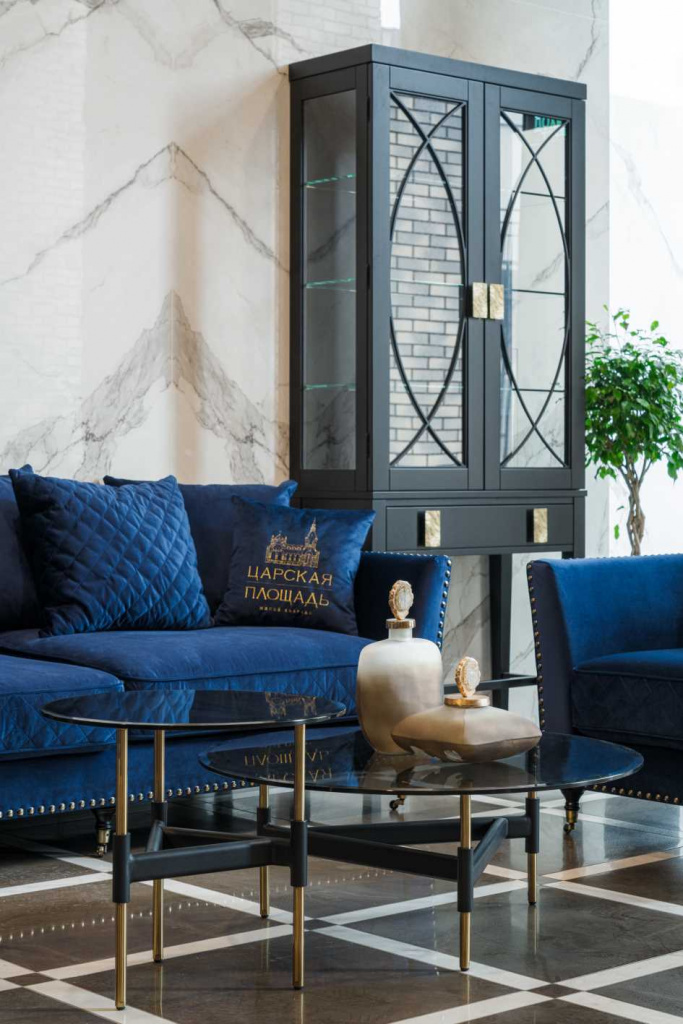
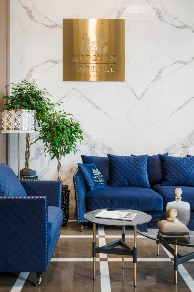
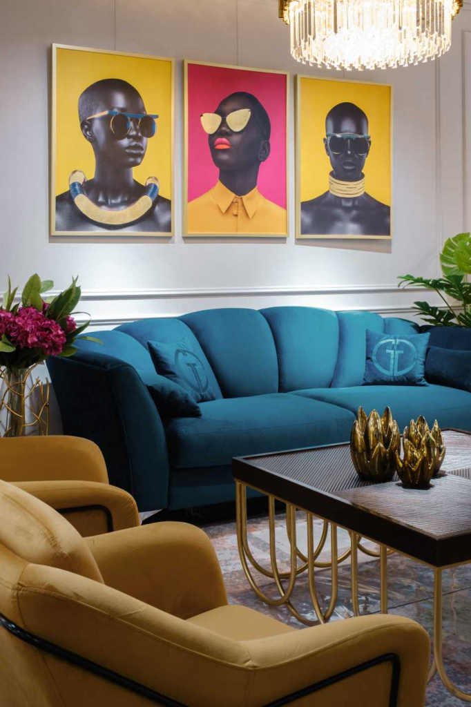
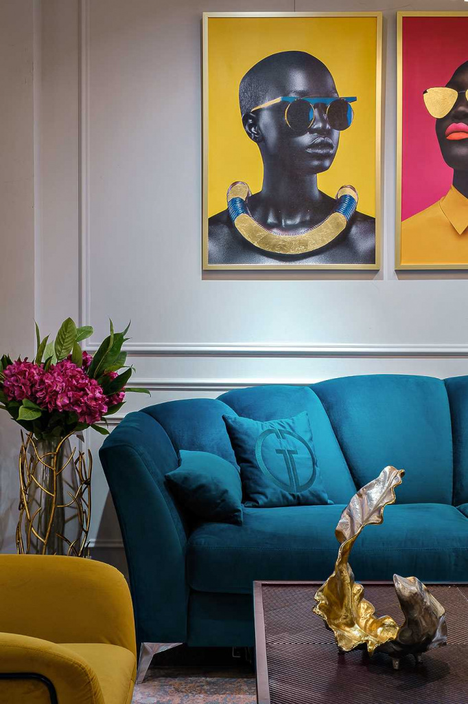
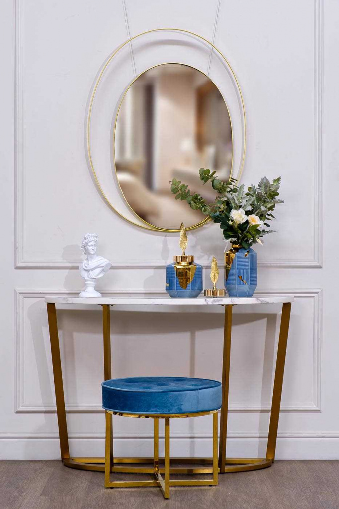
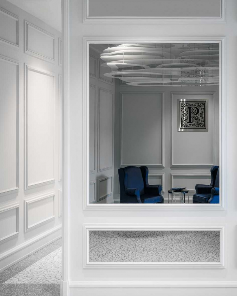
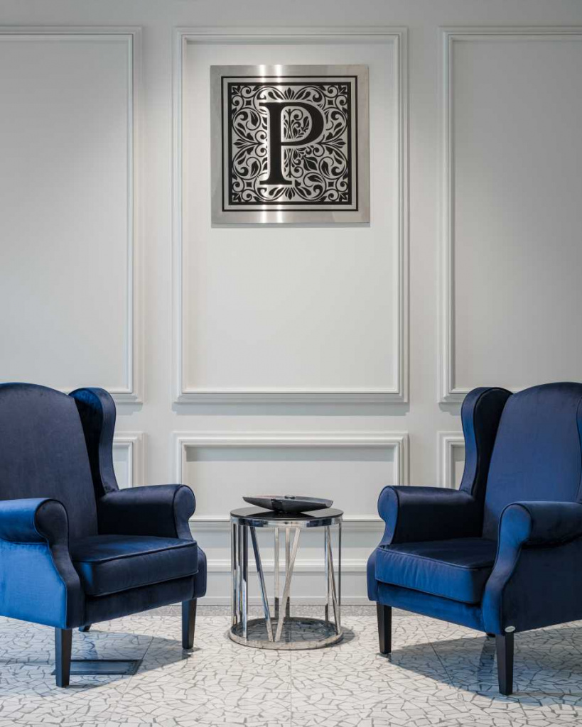
Living room
Blue tones have taken root so well in living rooms that they are used in a variety of stylistic directions: modern style, minimalism, classic, hi-tech. If desired, the owners can experiment with the decor. For example, if you want to create an informal atmosphere, you should choose a light gray background as a basis and arrange blue furniture: cabinets, armchairs. A successful addition to such a composition would be posters in the pop art style.
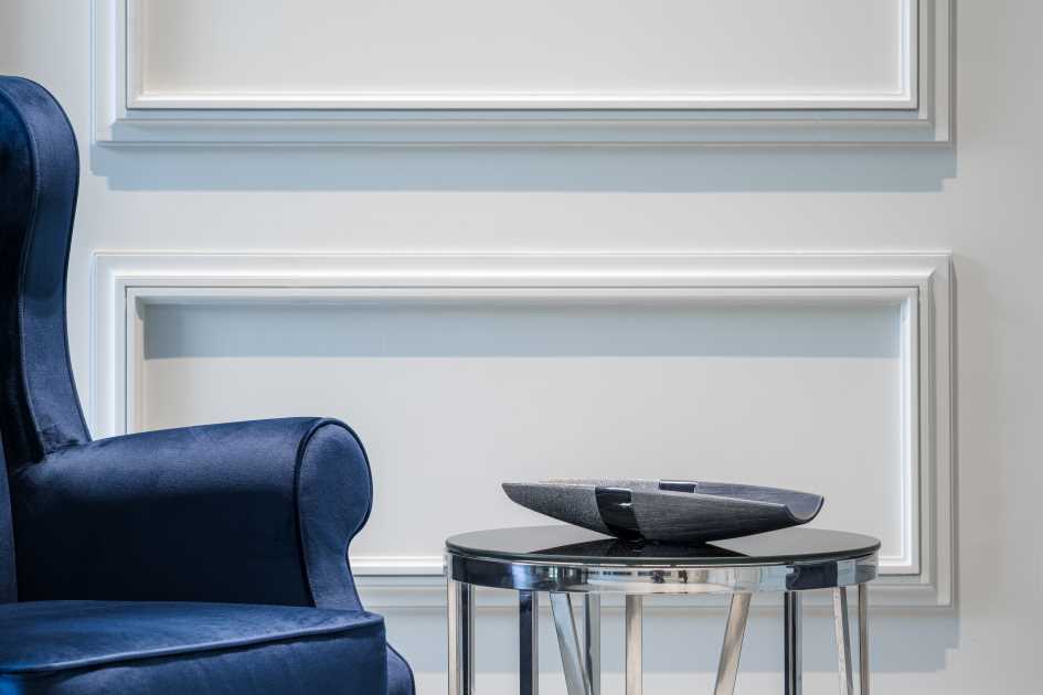
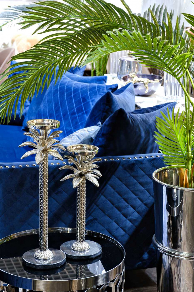
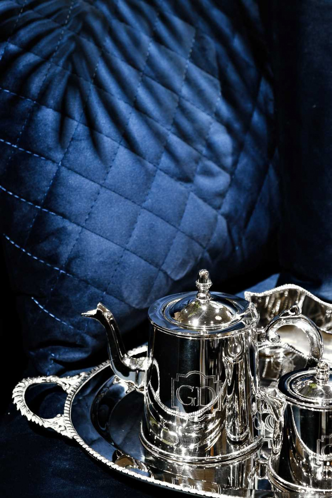
If you want to emphasize the high social status of the owners, you can choose a combination of deep blue shades with silver and gold. The main thing is not to overdo it, since the abundance of “expensive” flowers will tire the eye. As for walls decorated with blue wallpaper or panels, they will be perfectly combined with solid wood furniture.
Children's room
Blue color is also suitable for decorating children's rooms. Deep blue, azure and other shades calm the child and relieve the feeling of anxiety when waking up. A competent combination of blue with other shades (for example, beige) will allow you to zone the space, dividing the room into a place for relaxation and a corner for games.
Of course, boys’ rooms are most often decorated in blue tones. They can be decorated thematically, in a pirate or nautical style. This will not require large expenses: it is enough to purchase suitable photo wallpaper and decorative elements. To decorate girls' rooms, they usually choose more neutral and eye-pleasing colors (for example, soft blue). Marine prints also look appropriate in rooms for little princesses.
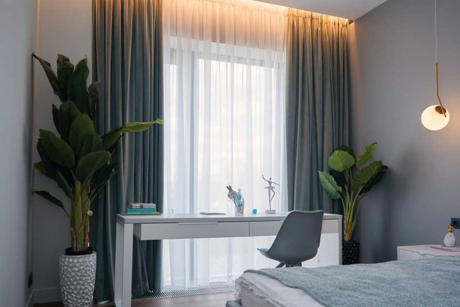
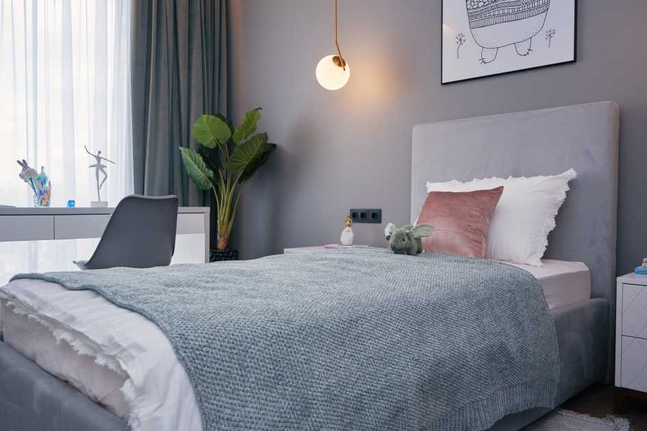
Bedroom
Blue color is the optimal solution for bedrooms in the Provence style. It is not advisable to use dark blue tones in places for night rest - the atmosphere should be as relaxing as possible. It is better to focus on light blue and bluish shades that soothe and lull. To play up the decor, you can paint one of the walls blue: the interior will acquire some depth. It should be complemented with beautiful blue and white curtains, bedspreads and bed linen.
As flooring for blue bedrooms, neutral shades are recommended: wooden parquet, light beige laminate. Particular attention should be paid to the finishing of the ceiling. So, a ceiling with an imitation of a starry sky and lighting will help you relax perfectly. Children fall asleep faster in such an environment, and adults enjoy the romantic atmosphere.
In cases where the family budget is not designed for such expenses, you can paint the ceiling with light blue paint or cover it with wallpaper with clouds painted on it. In such airy interiors it is surprisingly easy to breathe. Even if the room has not been wet cleaned for a long time, it will look cleaner.
Bathroom
Since bathrooms in Russian apartments are not large in size, moderation should be observed when using blue in decoration. So, you can lay out the floor or one of the walls with blue tiles. The blue pattern on the white tile also looks original. Blue plumbing fixtures (sinks, toilets) are an option for everyone, but an acrylic insert in a sea green bathtub is what you need. As a finishing touch, hang fluffy blue towels and arrange accessories: glasses for toothbrushes, soap dispensers.
Hallway
The blue color also looks good in the hallway. Here a lot depends on its area. If the hallway is small, you will have to abandon the use of dark blue tones; they are inappropriate in compact enclosed spaces. But in spacious and well-lit hallways, dark blue looks quite harmonious.
Thus, blue can be called one of the most successful interior design colors. It has a beneficial effect on the psyche, relieves tension, and helps to relax the eyes. If you follow moderation, using the color blue you will be able to create a cozy, comfortable home that your guests will admire.
- Color combination in the interior - what shades go together?
- Mint color in the interior - meaning, features, compatibility with other colors
- Colors in the kitchen interior: winning shades and recommendations for choosing a color palette
- How to visually enlarge a room: ideas and methods, advice from professional designers
- Interior in gray colors: the best design solutions and compatibility with other colors
- Selecting a palette for the interior: trends for 2022
- Striving for perfection: how to use white in the interior