
Colors in the kitchen interior: winning shades and recommendations for choosing a color palette
Content:
- The most successful colors for the kitchen interior
- Color combinations in the kitchen interior
- Selecting a color palette for the kitchen: what else to consider
The kitchen is the heart of the home, a room that personifies home, comfort and family warmth. In the morning, the kitchen is filled with the aroma of coffee and fresh pastries, and in the evenings, household members gather here to enjoy a delicious dinner and share news. Therefore, it is especially important to create a comfortable atmosphere in the kitchen, and a competent choice of colors plays a special role in this. The colors in the kitchen interior should lift your spirits, stimulate your appetite, soothe and at the same time invigorate. Choosing the right shades to decorate your kitchen is not difficult - if you take the advice of designers, the result will exceed all expectations.
The most successful colors for the kitchen interior
The combination of colors in the interior of the kitchen decides a lot. It is the combination of tones that determines how the environment will influence a person’s mood and appetite, how textures will be revealed, whether the kitchen will become more spacious and lighter or, conversely, darker and visually smaller. The color palette in the interior can set a very different atmosphere: laconic and strict, airy and romantic, bright and festive. To choose the ideal design solution, you should familiarize yourself with the features of several colors that are considered advantageous for the kitchen.
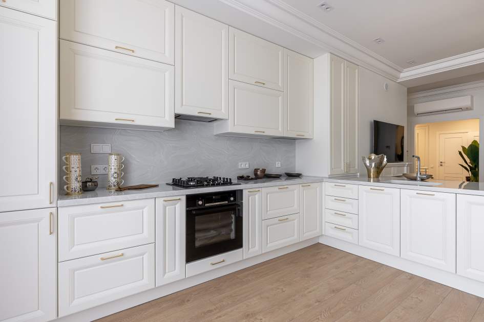
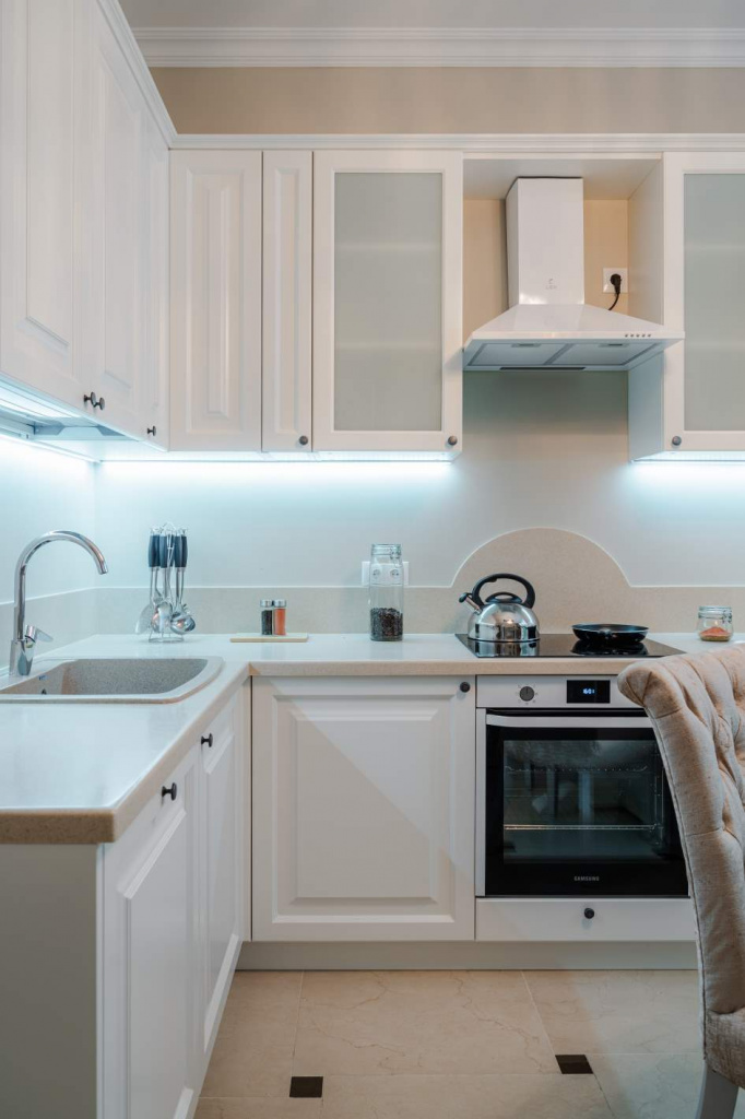
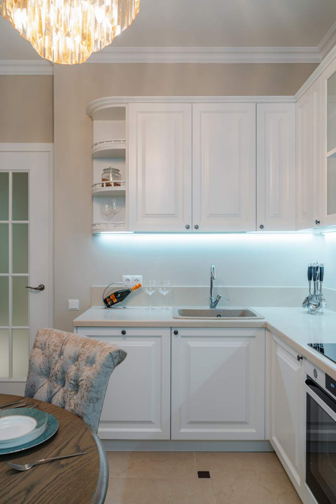
White color in the kitchen
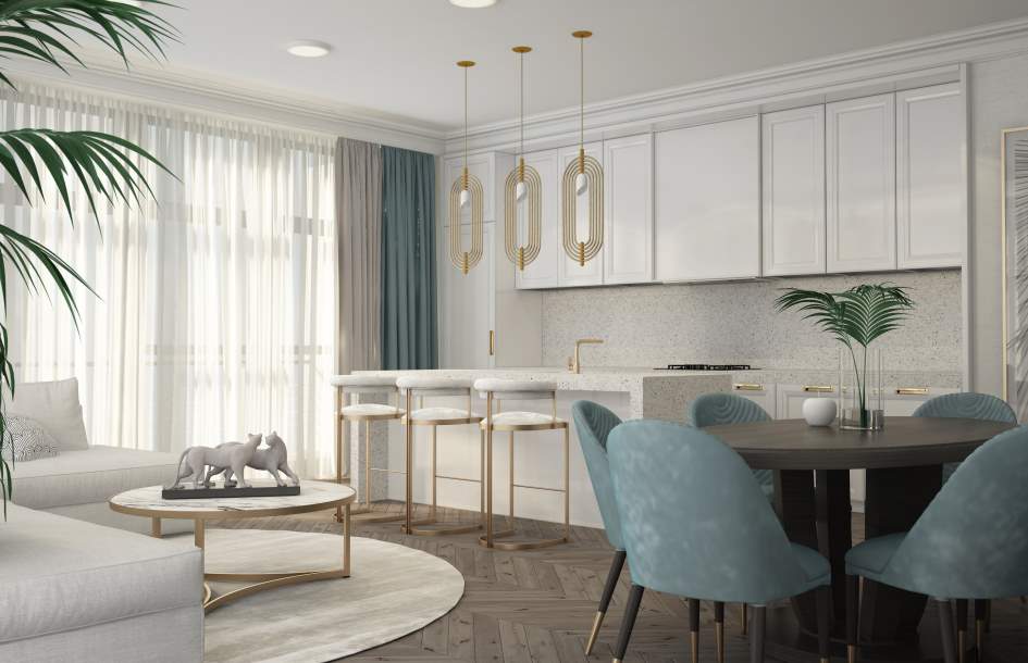
A kitchen in white colors is a trend that has remained popular for many years. White kitchen furniture helps fill the room with light, gives it volume, and visually increases the space.
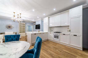
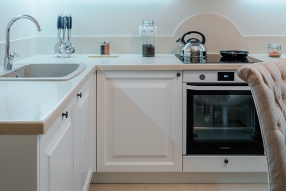
However, it is undesirable to use only white in the kitchen: the atmosphere will seem cold and hospital-sterile. It is much better to “insulate” the room with accents of delicate and eye-pleasing shades. These could be curtains, wall panels, cute accessories or, for example, a kitchen island in the shade of creme brulee, champagne, or baked milk. Contrasting elements also look appropriate in white kitchens: black bar stools, countertops, household appliances.
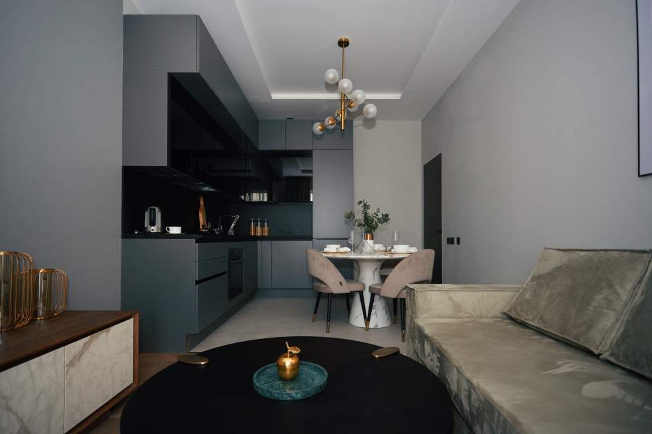
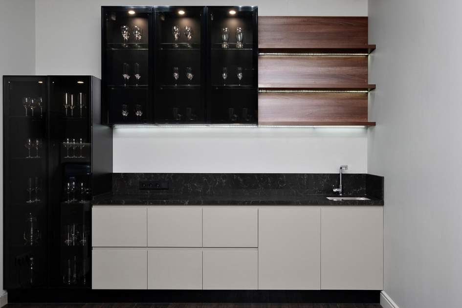
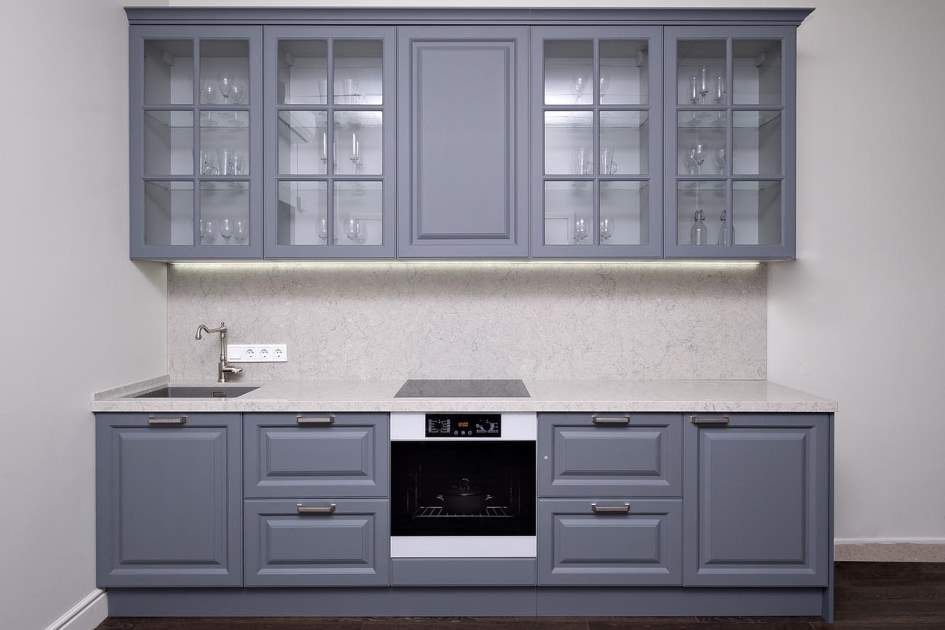
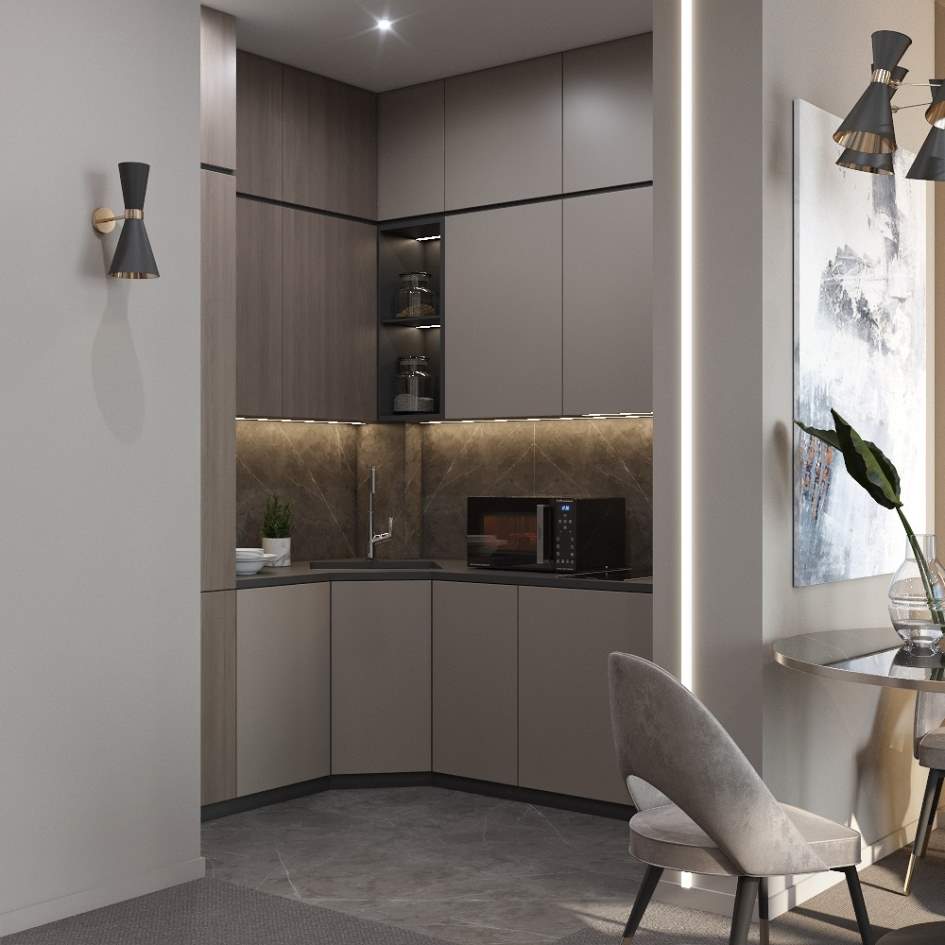
Fifty Shades of Gray
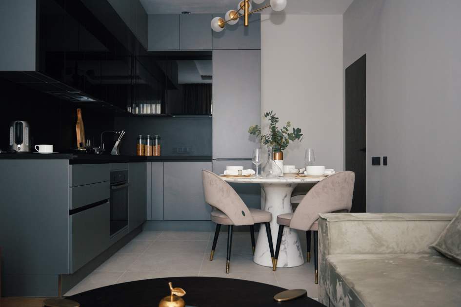
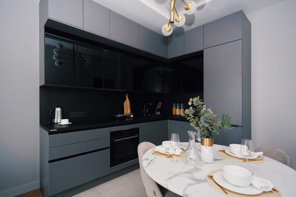
Not so long ago, people underestimated the color gray, considering it dull and dull. However, this is not so: in color there are many shades of gray, from the exquisite tone of “river mother of pearl” to noble chrome, which can advantageously reflect surfaces, and mystical marengo. Gray shades are considered favorable for the kitchen due to the following advantages:
- The ability to add depth to a design, to act both as the main background and as an accent.
- Compatibility with any kitchen interior styles.
- Non-staining: gray surfaces do not require constant maintenance.
So gray is a welcome guest in the kitchen. However, when choosing a kitchen color palette, certain rules must be taken into account. If the interior predominantly uses cold shades (anthracite, periwinkle), they should be softened with warm accents. Dark gray tones are inappropriate in the design of small kitchens. A compact kitchen combined with a dark furniture set will look very tiny, especially if it faces north.
Purple and lavender
Purple and lavender tones, occupying neighboring places on the color wheel, will serve as the basis for a catchy and rich composition. Furniture and home textiles in the kitchen can have a delicate “light lavender” shade, and purple decorative items will play the role of accent spots.
Experienced interior designers have other secrets. So, if the finishing and kitchen facades are the same shade, there will be a visual imbalance. Either the furniture or finishing materials should be bright. Another nuance concerns prints: large prints “eat up” space, while small patterns visually enlarge the kitchen.
Brown and coffee
Brown and coffee colors, embodying naturalness, give the kitchen a particularly cozy, homely atmosphere. These calm, peaceful tones do not tire your eyesight, do not get boring, and have a positive effect on the psyche. In addition, they are very practical: dirt is not visible on brown surfaces (both matte and glossy).
To prevent the design of a brown kitchen from seeming boring and a little heavy, it is better to dilute the interior with details in light colors. A good example is a kitchen set with a brown facade and a beige countertop. The kitchen sink is also matched to the color of the countertop. Such compositions look best in kitchens with large windows facing east, west or north.
Kitchen in yellow tones
The kitchen is one of the most suitable places for sunny yellow shades. Yellow color, which makes up for the lack of sunlight, looks great even in cramped kitchens and harmonizes with any natural materials: stone, parquet, wooden wall panels. Shades of yellow can vary from muted sand to piercingly bright.
If yellow seems too saturated to create the main background of the kitchen, small splashes of yellow will decorate and enliven the neutral base. The choice of shades depends on the amount of natural light in the kitchen. Thus, soft and mixed tones (sand, straw, mustard) are relevant for light kitchens, and active and self-sufficient shades like lemon are suitable for darkened rooms.
Blue color in the kitchen
The blue color, representing calm and serenity, is often used both in the production of kitchen sets and in kitchen decoration. The color blue has many fans, because it performs many useful functions:
- Lengthens the kitchen, makes it taller and lighter.
- Creates the illusion of plenty of fresh air in the room.
- Gives the kitchen a laconic and elegant appearance.
- Charges you with energy and vigor for the whole day.
In the kitchen interior, blue can be combined with most colors, even with red - calm shades of red should be used in the decor. Ideal compatibility with blue and light shades of wood (for example, pine). Blue is especially appropriate in kitchens located on the south side: the rays of the sun soften the coldness of the color presentation.
The only warning: dark blue shades in the kitchen should be used in strictly measured doses. This is especially true for melancholic people: the abundance of dark blue can cause depression in them. In addition, too much dark blue can plunge the kitchen into darkness, as well as kill the most brutal appetite.

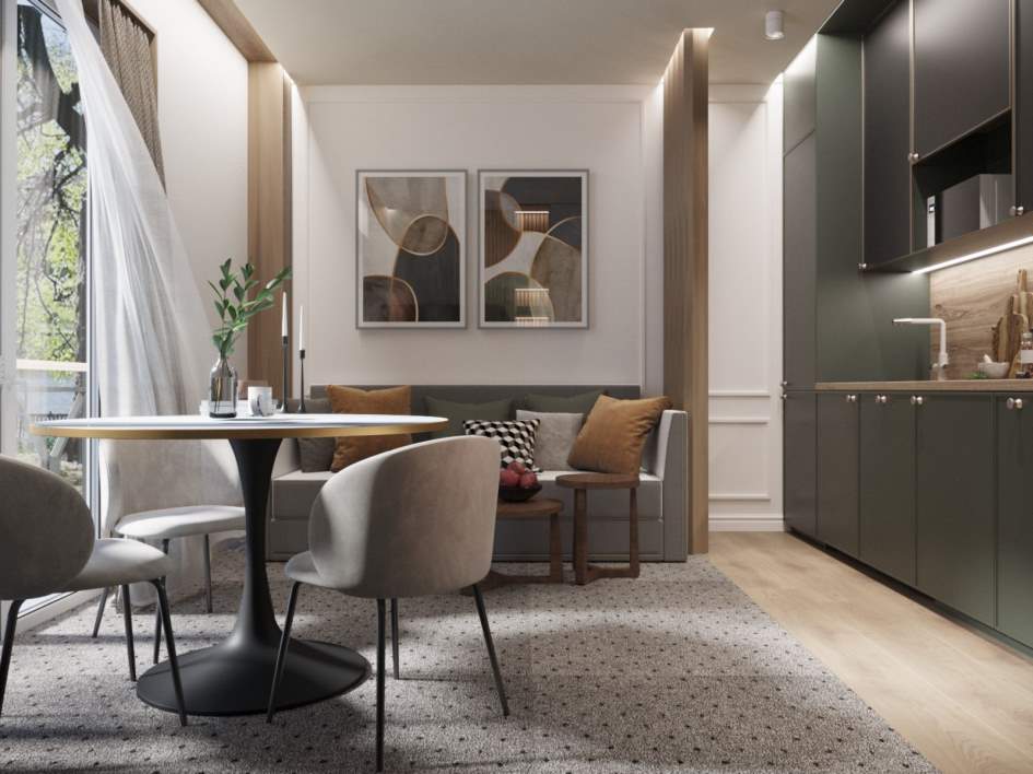
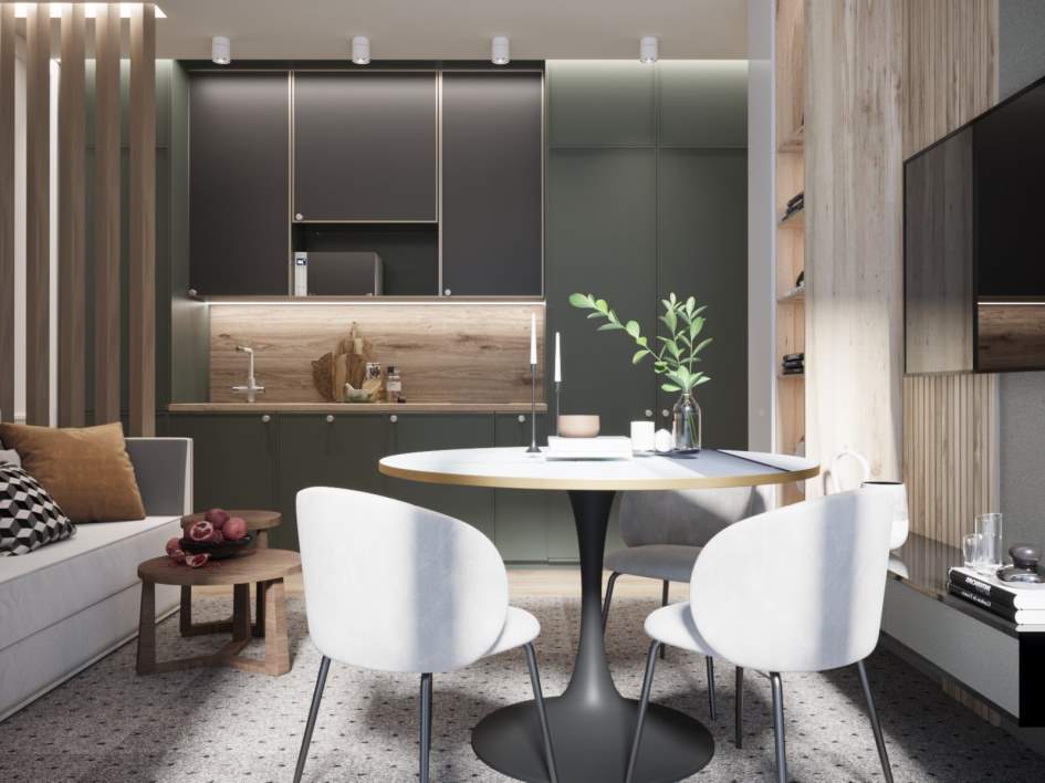
Green and emerald shades in the kitchen
A win-win option for kitchens of various sizes and layouts is the emerald green color scheme. The shades of young foliage remind people of nature, as well as healthy, natural foods. Just remember the shelves with eco-products from supermarkets: they are usually marked with green stickers. And green color calms, induces pleasant thoughts, relaxes vision - we can say that it has practically no drawbacks.
The peculiarity of green color is its huge variety of shades, tones and halftones. In addition to green and emerald, the color palette includes shades that are suitable for kitchen interiors, such as pistachio, mint, June bud, and even a shade with the funny name “toad in love.”
Decorating a kitchen in green tones will not cause any special problems: both finishers and manufacturers of kitchen furniture love green. But difficulties may arise with kitchen appliances, although if you wish, you can easily find on sale a light green refrigerator or a microwave oven in a greenish Chartreuse hue. Rich shades of green are suitable for decorating and dividing the kitchen into functional zones (for example, zoning with a light green bar counter).


Color combinations in the kitchen interior
Blue and white
Timeless classics used in kitchen furnishings are calming and refreshing. A person who is in such a kitchen has the most pleasant associations: blue sky, sea breeze, sunny frosty day. Various variations are welcome in this ensemble: for example, instead of white you can use cream, instead of blue - indigo or light blue.
Textures are selected depending on the style of the kitchen interior. Thus, classic interiors are perfectly complemented by matte surfaces, while luxurious gloss is preferable for eclectic styles. If the color palette seems too cold, the situation will be corrected by a solid wood buffet or colorful warm accents: bright textiles, multi-colored dishes.
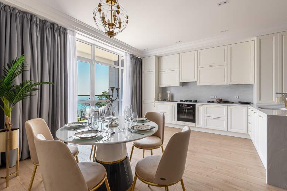
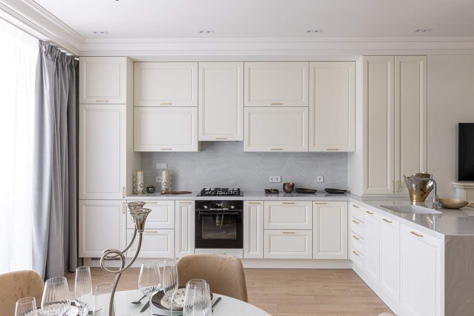
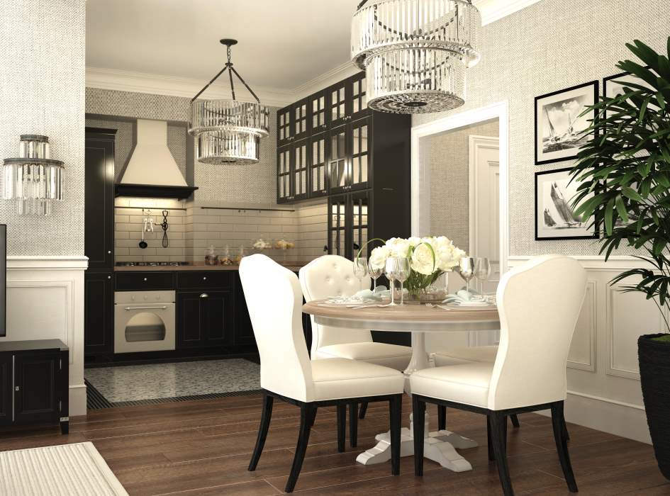
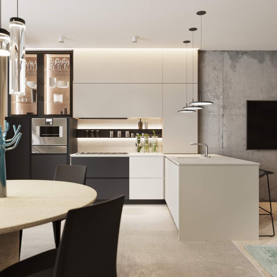
White and brown
This design solution is considered one of the most effective. Due to their versatility, brown and white colors get along well with each other and with other shades. However, it is important to maintain the correct proportions (for example, 50 to 50), otherwise the picture will turn out to be inexpressive.
Advantages of combining brown and white:
- Beneficial effects on the psyche and general atmosphere.
- Compatibility with most colors and materials.
- The opportunity to choose furniture and appliances for the kitchen to suit every taste.
In the white and brown interior of the kitchen, richly decorated furniture and accessories look good: tables and chairs with carved legs, vintage chests of drawers, chandeliers with pendants. And natural and artificial flowers and compositions of indoor plants fit organically into such an ensemble.
Green and pink
A romantic combination of pink and green, reminiscent of blooming gardens, is most often used when decorating bedrooms. However, there is a place for it in the interior of the kitchen. Shades of pink that are associated with food and stimulate the appetite are suitable for decorating the dining area: salmon, berry, peach.
A worthy pair for pink will be an emerald shade. If you want to add a touch of freshness, you can replace it with mint, and olive tones will add warmth and comfort to the composition. In this combination of active shades, a third tone is also appropriate: for example, mother-of-pearl or beige kitchen accessories.
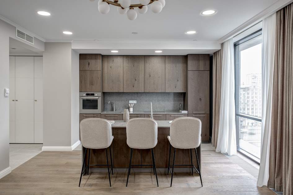
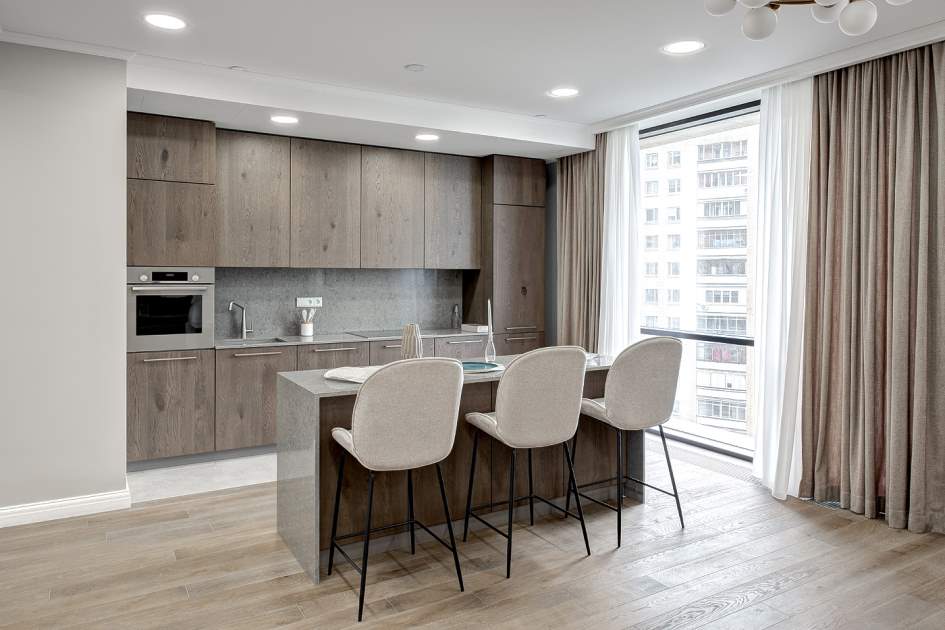
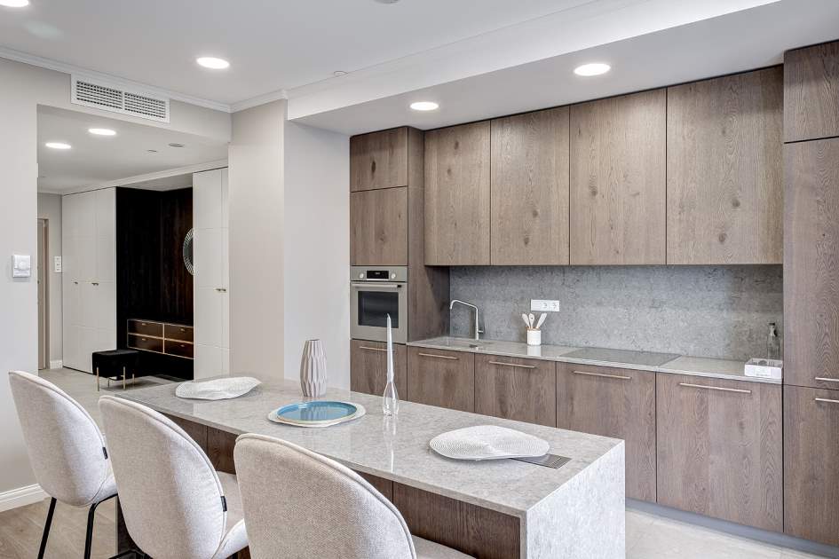
Grey and beige
The use of gray and beige in the interior is remarkable because it allows you to minimize mistakes in kitchen design. In addition, this option is now in trend - natural shades confidently take first place in popularity. A duet of two natural colors can be easily integrated into any style and complemented with any accents.
The choice of the main background is influenced by the layout of the kitchen. If the kitchen windows face north, it is better to choose a warm beige as a base, which adds warmth and comfort. Gray in this case will be used in the form of decorative inclusions. In kitchens with an abundance of daylight, a predominance of cool shades of gray is allowed, which will be complemented by details in sand and biscuit tones.
Selecting a color palette for the kitchen: what else to consider
Choosing the optimal color solutions for the kitchen is a creative and multifaceted process. Here's some more useful information on choosing shades that will help you achieve the perfect result:
- There is no need to be afraid of using glossy surfaces - perhaps this is one of the best ways to optically expand space. Gloss is “friendly” with almost all interior styles, fills the kitchen with air and light, and gives the interior a complete look. Thanks to the ability of glossy facades to reflect daylight and artificial light, the kitchen begins to play with fresh colors and visually increases in size - for this reason, fashion designers often use gloss in their projects.
- The central element of the kitchen, from which people start when choosing a color scheme, is usually the kitchen set. Tables and cabinets can be made in both neutral shades and bright colors that attract the eye. No less important is the choice of color for large household appliances: refrigerator, stove, dishwasher. There are two options here: installing appliances in contrasting tones or disguising them under the color that predominates in the kitchen design.
- Experts advise using no more than three colors when arranging a kitchen. 60% of the space should be occupied by the dominant background, and the remaining 40% should be given to decorative accents and tones that play the role of “second fiddle.” It is advisable that neutral shades act as the base tone. Otherwise, the eyes will get tired of bright colors, and the space will look tacky.
- Monochrome kitchen interiors look attractive, but require the use of expensive furniture and materials. In addition, in such interiors, defects in planning and finishing are unacceptable: they immediately catch the eye. The same applies to lighting: its improper organization can negate all efforts to arrange the kitchen.
- The shade of the kitchen apron, which protects the kitchen wall from grease and moisture, is matched to the color of the countertop or the facade of the furniture set.
Garda Decor store specialists will assist in selecting the most advantageous color solutions for kitchen decoration. Thanks to the recommendations of experienced designers, it will be possible to create a cozy kitchen in which all family members will feel comfortable. If you wish, you can also use ready-made design solutions - the assortment includeskitchen kits, allowing you to make your dream of a beautiful and original kitchen space come true.
- Color combination in the interior - what shades go together?
- Layout and design of a kitchen with a sofa: how to organize a comfortable space
- Kitchen layout: what options are there, designer’s advice on how to organize it correctly< /li>
- Selecting a palette for the interior: trends for 2022
- Interior in gray colors: the best design solutions and compatibility with other colors
- Blue color in the interior and what other shades does it combine with
- Mood color - lavender!
- Striving for perfection: how to use white in the interior